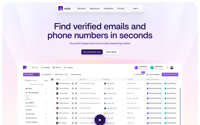
Preview image. Unlock full-res
Lilac haze over a bright canvas. A soft, vibrant glow that illuminates precision tools.
Color palette
Primary brand color, used for prominent headlines, active navigation items, and interactive elements. Its deep hue implies authority and sophistication.
Subtle background gradient for hero sections and key promotional blocks, creating a soft, ethereal brand presence.
Decorative gradient for dynamic visual elements, evoking a sense of innovative energy.
Background for deeply embedded sections or distinct content blocks, providing depth.
Vivid accent for key interactive elements like input focus states, guiding user attention with high contrast.
Secondary accent for subtle UI flourishes and decorative icons, adding a touch of vibrancy.
Page backgrounds, surface elements, text on dark backgrounds.
Subtle background for card surfaces and alternating section backgrounds, providing gentle visual separation.
Primary body text and navigation links, ensuring readability on light backgrounds.
Verification elements and icon fills, a dark blue that provides anchor points in the UI.
Subtle borders and minor text details, almost blending into light backgrounds.
Subtle border color for ghost buttons and interactive elements, indicating hover or focus states without harshness.
Typography
- Weights
- 500
- Sizes
- 24px, 32px, 40px, 56px, 64px
- Line height
- 1
- Letter spacing
- normal
- Fallback
- Montserrat
Primary display font for all headings. The custom 'Britti Sans' with its geometric yet friendly characteristics sets a distinctive brand voice, ensuring headlines feel approachable yet impactful. Constant 1.0 line-height creates a tight, modern aesthetic.
- Weights
- 400, 500, 700
- Sizes
- 12px, 14px, 16px
- Line height
- 1.3, 1.4, 1.5
- Letter spacing
- normal
- Fallback
- Inter
Functional typeface for body text, navigation, buttons, and form elements. Its clear, legible design ensures usability across all scales. Varied line heights adapt to content density.
Spacing & shape
Elevation
Components
Pill-shaped with a 1440px border-radius, background from Wiza Violet, text is Cloud Canvas. Padding is 18px vertical, dynamic horizontal padding determined by content, using 8px padding on the provided component. Subtle multi-layer shadow: `rgba(18, 55, 105, 0.08) 0px 2px 4px 0px, rgba(18, 55, 105, 0.04) 0px 1px 1px 0px, rgba(18, 55, 105, 0.08) 0px 0px 0px 1px`.
Text in Prose Black, transparent background. No explicit border, but has implicit spacing. Padding 18px vertical, dynamic horizontal. Used for secondary actions that shouldn't compete with the primary.
Text in Wiza Violet, no background or border. Inter font, weight 500, size 16px. Used for main navigation items.
Rounded corners at 40px, no background, no shadow. Padding varies from 0px to 8px. Displays individual user information.
Rounded corners at 10px, Cloud Canvas background. Text in Prospect Purple. Has a subtle inactive border with `rgba(47, 1, 151, 0.08)`. Padding 0px vertical, 14px horizontal.
Rounded corners at 40px, Ghost Gray background at 50% opacity. No shadow or border. Used for outlining problems or concepts in a light, contained manner.
Rounded corners at 8px, Cloud Canvas background. Text in Wiza Violet. Elevated with a multi-layer shadow to visually separate it from content: `rgba(18, 55, 105, 0.08) 0px 2px 4px 0px, rgba(18, 55, 105, 0.04) 0px 1px 1px 0px, rgba(18, 55, 105, 0.08) 0px 0px 0px 1px`.
Guidelines
- Prioritize Britti Sans 500 for all headlines at sizes 24px and above, ensuring a consistent 1.0 line-height.
- Utilize Wiza Violet (#26114a) for primary branding elements and key interactive text.
- Apply the 1440px radius to all primary action buttons and prominent pill-shaped containers.
- Use Ghost Gray (#f6f7fa) with 50% opacity for subtle, non-interactive card backgrounds to introduce depth without visual clutter.
- Elevate critical interactive elements, such as dropdowns and tooltips, with the multi-layer shadow `rgba(18, 55, 105, 0.08) 0px 2px 4px 0px, rgba(18, 55, 105, 0.04) 0px 1px 1px 0px, rgba(18, 55, 105, 0.08) 0px 0px 0px 1px`.
- Maintain Inter font for all body text, links, and forms, using weights 400, 500, and 700 with respective line heights of 1.3, 1.4, and 1.5.
- Avoid using harsh, single-layer shadows; prefer the provided multi-layer subtle shadows for depth.
- Do not introduce new primary colors outside of the Wiza Violet and Prospect Purple palette.
- Never use square corners for interactive elements; the minimal 8px radius or the 1440px pill-shape is the standard.
- Do not use dark backgrounds for main content sections; the theme is predominantly light, relying on Cloud Canvas and Ghost Gray.
- Avoid line-heights exceeding 1.5 for Inter typeface, or deviating from 1.0 for Britti Sans headlines, to maintain the site's compact text block aesthetic.
About this system
ShowHide
Wiza embodies a 'digital alchemy' aesthetic, blending a clean, approachable interface with subtle, almost magical, gradient accents. The dominant bright canvas, interspersed with soft lilac and white backgrounds, creates an airy yet grounded feel. Key information is spotlighted by a deep brand violet for headlines and interactive elements, while the generous use of 1440px pill-shaped radii for primary actions and subtle, multi-layered shadows on elevated components provides a nuanced sense of depth and a signature soft-futuristic touch.
The layout is primarily max-width contained, but hero sections extend full-bleed with the 'Gradient Aura' background, creating an expansive initial impression. The page adopts a 'scenic scroll' rhythm, with distinct sections separated by generous vertical spacing. Content is typically arranged in either a centered stack for prominent headlines and CTAs, or a clear two-column structure (text on left, visual on right, or vice-versa) for feature descriptions. Feature areas often use a card-grid pattern, showcasing information in digestible blocks. Navigation is handled by a standard sticky top bar, providing constant access to key areas. The density is spacious, ensuring ample breathing room around content.
This site features a blend of product screenshots, abstract geometric patterns, and minimal iconography. Product screenshots are typically tightly cropped and integrated into the UI, showcasing the tool's functionality directly. Abstract graphics, often in the brand's violet gradient, are used decoratively to create atmospheric backdrops in hero sections or as subtle background textures, providing a sense of digital fluidity. Icons are primarily filled, using brand violet or near-black, maintaining a cohesive and modern interaction system. The overall density of imagery is balanced, supporting the textual content rather than dominating it, aiming for explanatory content and product showcase.
Reminiscent of Apollo.io, Chili Piper, Webflow, Linear.
# Wiza — Style Reference
> Lilac haze over a bright canvas. A soft, vibrant glow that illuminates precision tools.

**Theme:** light

**Site:** https://wiza.co

Wiza embodies a 'digital alchemy' aesthetic, blending a clean, approachable interface with subtle, almost magical, gradient accents. The dominant bright canvas, interspersed with soft lilac and white backgrounds, creates an airy yet grounded feel. Key information is spotlighted by a deep brand violet for headlines and interactive elements, while the generous use of 1440px pill-shaped radii for primary actions and subtle, multi-layered shadows on elevated components provides a nuanced sense of depth and a signature soft-futuristic touch.

## Tokens — Colors

| Name | Value | Token | Role |
|------|------|------|------|
| Wiza Violet | `#26114a` | `--color-wiza-violet` | Primary brand color, used for prominent headlines, active navigation items, and interactive elements. Its deep hue implies authority and sophistication. |
| Gradient Aura | `#d2bdff` | `--color-gradient-aura` | Subtle background gradient for hero sections and key promotional blocks, creating a soft, ethereal brand presence. |
| Multicolor Burst | `#c7adff` | `--color-multicolor-burst` | Decorative gradient for dynamic visual elements, evoking a sense of innovative energy. |
| Deep Plum Gradient | `#420365` | `--color-deep-plum-gradient` | Background for deeply embedded sections or distinct content blocks, providing depth. |
| Prospect Purple | `#3e0079` | `--color-prospect-purple` | Vivid accent for key interactive elements like input focus states, guiding user attention with high contrast. |
| Magic Wand | `#7e43ff` | `--color-magic-wand` | Secondary accent for subtle UI flourishes and decorative icons, adding a touch of vibrancy. |
| Cloud Canvas | `#ffffff` | `--color-cloud-canvas` | Page backgrounds, surface elements, text on dark backgrounds. |
| Ghost Gray | `#f6f7fa` | `--color-ghost-gray` | Subtle background for card surfaces and alternating section backgrounds, providing gentle visual separation. |
| Prose Black | `#222222` | `--color-prose-black` | Primary body text and navigation links, ensuring readability on light backgrounds. |
| Deep Sea | `#11244a` | `--color-deep-sea` | Verification elements and icon fills, a dark blue that provides anchor points in the UI. |
| Dove Gray | `#9491a1` | `--color-dove-gray` | Subtle borders and minor text details, almost blending into light backgrounds. |
| Lilac Tint | `#edecff` | `--color-lilac-tint` | Subtle border color for ghost buttons and interactive elements, indicating hover or focus states without harshness. |

## Tokens — Typography

### Britti Sans
- **Substitute:** Montserrat
- **Weights:** 500
- **Sizes:** 24px, 32px, 40px, 56px, 64px
- **Line height:** 1
- **Letter spacing:** normal
- **Role:** Primary display font for all headings. The custom 'Britti Sans' with its geometric yet friendly characteristics sets a distinctive brand voice, ensuring headlines feel approachable yet impactful. Constant 1.0 line-height creates a tight, modern aesthetic.

### Inter
- **Substitute:** Inter
- **Weights:** 400, 500, 700
- **Sizes:** 12px, 14px, 16px
- **Line height:** 1.3, 1.4, 1.5
- **Letter spacing:** normal
- **Role:** Functional typeface for body text, navigation, buttons, and form elements. Its clear, legible design ensures usability across all scales. Varied line heights adapt to content density.

## Tokens — Type Scale

Perfect Fourth (1.333) from 16px base.

| Role | Size | Line height | Letter spacing |
|------|------|------|------|
| caption | 12px | 1.3 | — |
| body | 16px | 1.5 | — |
| subheading | 24px | 1 | — |
| heading | 32px | 1 | — |
| heading-lg | 40px | 1 | — |
| display | 56px | 1 | — |

## Tokens — Spacing

- **Card padding:** 0px
- **Element gap:** 8px

## Tokens — Radius

- **Default:** 8px
- **Buttons:** 1440px
- **Cards:** 40px
- **hero-graphic:** 56px
- **input:** 10px
- **tags:** 6px

## Tokens — Elevation

- **Dropdown Menu/Contextual Popover:** `rgba(18, 55, 105, 0.08) 0px 2px 4px 0px, rgba(18, 55, 105, 0.04) 0px 1px 1px 0px, rgba(18, 55, 105, 0.08) 0px 0px 0px 1px`
- **Primary Call to Action Button:** `rgba(18, 55, 105, 0.08) 0px 2px 4px 0px, rgba(18, 55, 105, 0.04) 0px 1px 1px 0px, rgba(18, 55, 105, 0.08) 0px 0px 0px 1px`
- **Sticky Navigation Bar (subtle):** `rgba(18, 55, 105, 0.08) 0px 2px 4px 0px, rgba(18, 55, 105, 0.04) 0px 1px 1px 0px`
- **Key Feature Card (prominent):** `rgba(14, 59, 101, 0.06) 0px 32px 24px -12px, rgba(14, 59, 101, 0.01) 0px 11px 4px 0px, rgba(14, 59, 101, 0.02) 0px 6px 4px 0px, rgba(14, 59, 101, 0.03) 0px 3px 3px 0px, rgba(14, 59, 101, 0.04) 0px 1px 1px 0px`
- **Input Focus State:** `rgba(47, 1, 151, 0.01) 0px 11px 4px 0px, rgba(47, 1, 151, 0.04) 0px 6px 4px 0px, rgba(47, 1, 151, 0.06) 0px 3px 3px 0px, rgba(47, 1, 151, 0.08) 0px 1px 1px 0px, rgba(47, 1, 151, 0.08) 0px 0px 0px 1px`

## Layout

The layout is primarily max-width contained, but hero sections extend full-bleed with the 'Gradient Aura' background, creating an expansive initial impression. The page adopts a 'scenic scroll' rhythm, with distinct sections separated by generous vertical spacing. Content is typically arranged in either a centered stack for prominent headlines and CTAs, or a clear two-column structure (text on left, visual on right, or vice-versa) for feature descriptions. Feature areas often use a card-grid pattern, showcasing information in digestible blocks. Navigation is handled by a standard sticky top bar, providing constant access to key areas. The density is spacious, ensuring ample breathing room around content.

## Imagery

This site features a blend of product screenshots, abstract geometric patterns, and minimal iconography. Product screenshots are typically tightly cropped and integrated into the UI, showcasing the tool's functionality directly. Abstract graphics, often in the brand's violet gradient, are used decoratively to create atmospheric backdrops in hero sections or as subtle background textures, providing a sense of digital fluidity. Icons are primarily filled, using brand violet or near-black, maintaining a cohesive and modern interaction system. The overall density of imagery is balanced, supporting the textual content rather than dominating it, aiming for explanatory content and product showcase.

## Components

### CTA Button Group

### Rating / Social Proof Block

### Contact Prospect Cards

### Primary Call to Action Button
*Interactive element*

Pill-shaped with a 1440px border-radius, background from Wiza Violet, text is Cloud Canvas. Padding is 18px vertical, dynamic horizontal padding determined by content, using 8px padding on the provided component. Subtle multi-layer shadow: `rgba(18, 55, 105, 0.08) 0px 2px 4px 0px, rgba(18, 55, 105, 0.04) 0px 1px 1px 0px, rgba(18, 55, 105, 0.08) 0px 0px 0px 1px`.

### Secondary Ghost Button
*Interactive element*

Text in Prose Black, transparent background. No explicit border, but has implicit spacing. Padding 18px vertical, dynamic horizontal. Used for secondary actions that shouldn't compete with the primary.

### Navigation Link
*Navigation*

Text in Wiza Violet, no background or border. Inter font, weight 500, size 16px. Used for main navigation items.

### User Profile Card
*Content display*

Rounded corners at 40px, no background, no shadow. Padding varies from 0px to 8px. Displays individual user information.

### Text Input Field
*Data entry*

Rounded corners at 10px, Cloud Canvas background. Text in Prospect Purple. Has a subtle inactive border with `rgba(47, 1, 151, 0.08)`. Padding 0px vertical, 14px horizontal.

### Feature Card (Subtle)
*Content display*

Rounded corners at 40px, Ghost Gray background at 50% opacity. No shadow or border. Used for outlining problems or concepts in a light, contained manner.

### Dropdown Menu
*Navigation/Interaction*

Rounded corners at 8px, Cloud Canvas background. Text in Wiza Violet. Elevated with a multi-layer shadow to visually separate it from content: `rgba(18, 55, 105, 0.08) 0px 2px 4px 0px, rgba(18, 55, 105, 0.04) 0px 1px 1px 0px, rgba(18, 55, 105, 0.08) 0px 0px 0px 1px`.

## Guidelines

### Do

- Prioritize Britti Sans 500 for all headlines at sizes 24px and above, ensuring a consistent 1.0 line-height.
- Utilize Wiza Violet (#26114a) for primary branding elements and key interactive text.
- Apply the 1440px radius to all primary action buttons and prominent pill-shaped containers.
- Use Ghost Gray (#f6f7fa) with 50% opacity for subtle, non-interactive card backgrounds to introduce depth without visual clutter.
- Elevate critical interactive elements, such as dropdowns and tooltips, with the multi-layer shadow `rgba(18, 55, 105, 0.08) 0px 2px 4px 0px, rgba(18, 55, 105, 0.04) 0px 1px 1px 0px, rgba(18, 55, 105, 0.08) 0px 0px 0px 1px`.
- Maintain Inter font for all body text, links, and forms, using weights 400, 500, and 700 with respective line heights of 1.3, 1.4, and 1.5.

### Don't

- Avoid using harsh, single-layer shadows; prefer the provided multi-layer subtle shadows for depth.
- Do not introduce new primary colors outside of the Wiza Violet and Prospect Purple palette.
- Never use square corners for interactive elements; the minimal 8px radius or the 1440px pill-shape is the standard.
- Do not use dark backgrounds for main content sections; the theme is predominantly light, relying on Cloud Canvas and Ghost Gray.
- Avoid line-heights exceeding 1.5 for Inter typeface, or deviating from 1.0 for Britti Sans headlines, to maintain the site's compact text block aesthetic.

## Agent Prompt Guide

### Quick Color Reference
- Text: #222222 (Prose Black)
- Background: #ffffff (Cloud Canvas)
- CTA Button Background: #26114a (Wiza Violet)
- CTA Button Text: #ffffff (Cloud Canvas)
- Accent: #3e0079 (Prospect Purple)
- Subtle Background: #f6f7fa (Ghost Gray)

### 3-5 Example Component Prompts
1. Create a hero section: 'Gradient Aura' background, centered headline 'Find verified emails and phone numbers' (Britti Sans 56px, weight 500, #26114a, lineHeight 1.0). Subtext 'The world's largest...' (Inter 16px, weight 400, #615e6, lineHeight 1.5). Below, two buttons: Primary CTA 'Get started for free' (Wiza Violet background, Cloud Canvas text, 1440px radius, 18px vertical padding, default shadow), next to it a secondary button 'Get a demo' (Prose Black text, transparent background, 18px vertical padding).
2. Create a feature card: Ghost Gray background at 50% opacity, 40px border-radius. Inside, a Britti Sans 24px weight 500 headline (#26114a, lineHeight 1.0) and Inter 14px weight 400 body text (#615e6, lineHeight 1.4). Top-left should have a small violet icon (#7e43ff).
3. Create an input field: Cloud Canvas background, 10px border-radius, border `rgba(47, 1, 151, 0.08)`. Placeholder text in Dove Gray (#9491a1), user input in Prospect Purple (#3e0079). Padding 0px vertical, 14px horizontal. On focus, add shadow `rgba(47, 1, 151, 0.01) 0px 11px 4px 0px, rgba(47, 1, 151, 0.04) 0px 6px 4px 0px, rgba(47, 1, 151, 0.06) 0px 3px 3px 0px, rgba(47, 1, 151, 0.08) 0px 1px 1px 0px, rgba(47, 1, 151, 0.08) 0px 0px 0px 1px`.
More like this








Keep what you find
A free account saves references to boards and can send you a weekly email of picks based on what you save.
To see every result, go Pro.