Preview image. Unlock full-res
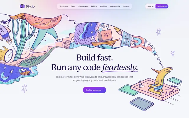
Whimsical tech playground. Muted violet meets playful pastels on a clean white backdrop.
Color palette
Primary headings, important text, interactive elements in high contrast areas.
Secondary text, footer links, subtle icons, provides a softer contrast.
Body text, general information, ensuring readability while maintaining brand tone.
Darkest background for footer, creating a grounded visual anchor.
Large background sections, especially hero and feature areas, providing a soft, shifting visual backdrop.
Subtle overlay gradients for texture or nuanced background effects.
Primary CTA buttons, active state indicators in navigation, drawing immediate attention.
Highlighting primary calls to action with an evocative, vibrant purple.
Page backgrounds, card surfaces, primary text on dark accents, inactive button backgrounds.
Subtle borders, divider lines, light background accents, hero section tint.
Lightest background for subtle differentiation, similar to Cloud White but with a warmer undertone.
Primary text for maximum contrast on light backgrounds, navigation elements.
Success states, checklist icons, indicating positive feedback.
Informational icons, secondary accent where a cooler tone is needed.
Warning icons, drawing attention to non-critical alerts.
Typography
- Weights
- 500
- Sizes
- 22px, 36px, 64px
- Line height
- 1.15, 1.33
- Letter spacing
- -0.45, -0.25
- Fallback
- Georgia, serif
Display headings and section titles. The slightly condensed, elegant serif face adds a touch of bespoke craftsmanship against the clean modern body text. Negative letter spacing at larger sizes pulls text together, creating a distinguished presence.
- Weights
- 325, 450, 500, 575
- Sizes
- 12px, 15px, 16px, 17px, 18px, 19px
- Line height
- 1.5, 1.66
- Letter spacing
- 0.025, 0.05
- Fallback
- Inter, Arial, sans-serif
Body text, navigation items, buttons, and all smaller textual elements. Its variable weights provide a broad spectrum for hierarchy within UI components, maintaining legibility and a consistent modern feel. The subtle positive letter spacing improves readability in smaller blocks.
Spacing & shape
Elevation
Components
Rounded pill shape with `Electric Violet` background (#7c3aed) and `Cloud White` text (#ffffff), `padding` of 0px vertical and 20px horizontal. Uses `Fricolage Grotesque` at `weight 450`.
Transparent background with `Cloud White` text (#ffffff) and a `0.25` opacity `Cloud White` (#ffffff) border. `Padding 32px` vertical and `16px` horizontal, `borderRadius` 16px. Uses `Fricolage Grotesque` at `weight 450`.
Transparent background with `Cloud White` text (#ffffff) and a `0.25` opacity `Cloud White` (#ffffff) border. `Padding 0px` vertical and `20px` horizontal, `borderRadius` 9999px. Uses `Fricolage Grotesque` at `weight 450`.
`Cloud White` background (#ffffff) with `Grape Vine` text (#281950). Features a subtle shadow `rgba(91, 33, 182, 0.125) 0px 0px 0px 0px`. `Padding 0px` vertical and `20px` horizontal, `borderRadius` 9999px.
Text link using `Fricolage Grotesque` `weight 450` in `Muted Violet` (#5e537c). Hover states likely involve color change or subtle underlines, but not explicitly defined in data.
Vector graphic logo using `Grape Vine` (#281950) with `Cloud White` (#ffffff) as background, positioned within the header bar.
Heavy header text using `Mackinac` `weight 500` at `64px` in `Grape Vine` (#281950), with negative letter-spacing for impact.
Guidelines
- Prioritize `Fricolage Grotesque` for all body text and UI labels, ensuring consistent `letter-spacing` as defined in the type scale.
- Apply `Electric Violet` (#7c3aed) as the singular background color for primary call-to-action buttons, pairing it always with `Cloud White` text (#ffffff).
- Use `Muted Violet` (#5e537c) for general body text and secondary informational elements to maintain a brand-aligned, readable tone.
- Employ `Mackinac` `weight 500` for all display and large section headings, utilizing its defined negative letter spacing for stylistic impact.
- Implement `9999px` corner radius for all primary and secondary button components to achieve a consistent 'pill' shape.
- Utilize `Ghost Gray` (#e7e6f4) for subtle borders and dividers, providing visual structure without harsh lines.
- Incorporate the `Accent Gradient Hero` (linear-gradient(to right, rgb(125, 211, 252), rgb(165, 180, 252), rgb(249, 168, 212))) sparingly for wide background sections to add a dynamic, pastel highlight.
- Avoid using `Electric Violet` (#7c3aed) for non-interactive text elements; reserve it strictly for primary calls to action.
- Do not introduce sharp corners on any interactive components; adhere to a minimum of `16px` radius for structural elements and `9999px` for buttons.
- Refrain from using strong, single-color shadows for elevation; rely on the subtle `rgba(91, 33, 182, 0.1) 0px 5px 5px -2px, rgba(91, 33, 182, 0.1) 0px 2px 4px -2px` for button elevation.
- Do not use black for body text; instead, use `Grape Vine` (#281950) or `Muted Violet` (#5e537c) for brand consistency.
- Ensure all text blocks maintain generous line heights from the type scale (`1.5` or `1.66`) to prevent dense, hard-to-read paragraphs.
- Avoid arbitrary use of the accent `linear-gradient` for small elements; it is designed for large background areas to provide a subtle, atmospheric shift.
About this system
ShowHide
This design orchestrates a playful yet competent aesthetic, combining whimsical hand-drawn illustrations with a structured technical layout. Its mood is one of approachable innovation, where complex systems are presented with a friendly, inviting tone. The foundation is a clean, bright canvas, subtly enhanced by soft, multi-color gradients that hint at dynamism and possibility without visual noise. Muted violet tones dominate text and interactive elements, providing a consistent brand presence that is distinctive but not overwhelming.
The page primarily uses a max-width `1200px` centered container for content, presenting a structured column layout. The hero section breaks this with a full-bleed application of the `Accent Gradient Hero` background, featuring a centered, prominent headline. Subsequent sections often employ a clean, white background with generous vertical spacing (`40px sectionGap`). A common content arrangement is a split layout, featuring text on one side and an accompanying illustration or feature visual on the other, creating a balance between information and visual interest. Navigation is a sticky top bar, containing both textual links and a prominent `Primary CTA Button`. The design feels spacious, with ample breathing room around elements.
The visual language is dominantly characterized by whimsical, hand-drawn vector illustrations featuring pastel color palettes and abstract, flowing forms. These illustrations are not masked or cropped but appear to organically 'spill' across sections or hover as isolated, narrative elements. They are used decoratively to evoke imagination and approachability for complex technical concepts, rather than literal product depiction. Iconography, when present, is simple, filled, and uses the defined accent/semantic colors. The overall density leans towards image-heavy, with illustrations taking significant visual space and often serving as backdrops or scene-setters alongside textual content.
Reminiscent of Vercel, Linear, Raycast, Figma, PlanetScale.
# Fly.io — Style Reference
> Whimsical tech playground. Muted violet meets playful pastels on a clean white backdrop.

**Theme:** light

**Site:** https://fly.io

This design orchestrates a playful yet competent aesthetic, combining whimsical hand-drawn illustrations with a structured technical layout. Its mood is one of approachable innovation, where complex systems are presented with a friendly, inviting tone. The foundation is a clean, bright canvas, subtly enhanced by soft, multi-color gradients that hint at dynamism and possibility without visual noise. Muted violet tones dominate text and interactive elements, providing a consistent brand presence that is distinctive but not overwhelming.

## Tokens — Colors

| Name | Value | Token | Role |
|------|------|------|------|
| Grape Vine | `#281950` | `--color-grape-vine` | Primary headings, important text, interactive elements in high contrast areas. |
| Lavender Bloom | `#a39ac1` | `--color-lavender-bloom` | Secondary text, footer links, subtle icons, provides a softer contrast. |
| Muted Violet | `#5e537c` | `--color-muted-violet` | Body text, general information, ensuring readability while maintaining brand tone. |
| Deep Plum | `#191034` | `--color-deep-plum` | Darkest background for footer, creating a grounded visual anchor. |
| Accent Gradient Hero | `#7dd3fc` | `--color-accent-gradient-hero` | Large background sections, especially hero and feature areas, providing a soft, shifting visual backdrop. |
| Accent Gradient Hero Transparent | `#7dd3fc` | `--color-accent-gradient-hero-transparent` | Subtle overlay gradients for texture or nuanced background effects. |
| Electric Violet | `#7c3aed` | `--color-electric-violet` | Primary CTA buttons, active state indicators in navigation, drawing immediate attention. |
| Primary CTA Gradient | `#8b5cf6` | `--color-primary-cta-gradient` | Highlighting primary calls to action with an evocative, vibrant purple. |
| Cloud White | `#ffffff` | `--color-cloud-white` | Page backgrounds, card surfaces, primary text on dark accents, inactive button backgrounds. |
| Ghost Gray | `#e7e6f4` | `--color-ghost-gray` | Subtle borders, divider lines, light background accents, hero section tint. |
| Lavender Mist | `#f1f2f9` | `--color-lavender-mist` | Lightest background for subtle differentiation, similar to Cloud White but with a warmer undertone. |
| Ash Charcoal | `#000000` | `--color-ash-charcoal` | Primary text for maximum contrast on light backgrounds, navigation elements. |
| Success Green | `#10b981` | `--color-success-green` | Success states, checklist icons, indicating positive feedback. |
| Info Blue | `#3b82f6` | `--color-info-blue` | Informational icons, secondary accent where a cooler tone is needed. |
| Warning Orange | `#f59e0b` | `--color-warning-orange` | Warning icons, drawing attention to non-critical alerts. |

## Tokens — Typography

### Mackinac
- **Substitute:** Georgia, serif
- **Weights:** 500
- **Sizes:** 22px, 36px, 64px
- **Line height:** 1.15, 1.33
- **Letter spacing:** -0.45, -0.25
- **Role:** Display headings and section titles. The slightly condensed, elegant serif face adds a touch of bespoke craftsmanship against the clean modern body text. Negative letter spacing at larger sizes pulls text together, creating a distinguished presence.

### Fricolage Grotesque
- **Substitute:** Inter, Arial, sans-serif
- **Weights:** 325, 450, 500, 575
- **Sizes:** 12px, 15px, 16px, 17px, 18px, 19px
- **Line height:** 1.5, 1.66
- **Letter spacing:** 0.025, 0.05
- **Role:** Body text, navigation items, buttons, and all smaller textual elements. Its variable weights provide a broad spectrum for hierarchy within UI components, maintaining legibility and a consistent modern feel. The subtle positive letter spacing improves readability in smaller blocks.

## Tokens — Type Scale

Augmented Fourth (1.414) from 12px base.

| Role | Size | Line height | Letter spacing |
|------|------|------|------|
| caption | 12px | 1.5 | 0.025em |
| body-sm | 15px | 1.5 | 0.025em |
| heading | 19px | 1.66 | 0.05em |
| heading-lg | 22px | 1.33 | -0.45px |
| display | 36px | 1.15 | -0.25px |
| hero-display | 64px | 1.15 | -0.45px |

## Tokens — Spacing

- **Max width:** 1200px
- **Section gap:** 40px
- **Card padding:** 24px
- **Element gap:** 16px

## Tokens — Radius

- **Buttons:** 9999px
- **defaultComponent:** 16px
- **navItems:** 10px
- **subtle:** 4px

## Tokens — Elevation

- **Light Pill Button:** `rgba(91, 33, 182, 0.1) 0px 5px 5px -2px, rgba(91, 33, 182, 0.1) 0px 2px 4px -2px`
- **Navigation Item Active State:** `rgba(67, 56, 202, 0.25) 0px 0px 0px 1px inset`
- **Card/Container Subtle Shadow:** `rgba(32, 34, 55, 0.075) 0px 0px 0px 1px, rgba(32, 34, 55, 0.05) 0px 10px 15px -3px, rgba(32, 34, 55, 0.05) 0px 4px 6px -4px`

## Layout

The page primarily uses a max-width `1200px` centered container for content, presenting a structured column layout. The hero section breaks this with a full-bleed application of the `Accent Gradient Hero` background, featuring a centered, prominent headline. Subsequent sections often employ a clean, white background with generous vertical spacing (`40px sectionGap`). A common content arrangement is a split layout, featuring text on one side and an accompanying illustration or feature visual on the other, creating a balance between information and visual interest. Navigation is a sticky top bar, containing both textual links and a prominent `Primary CTA Button`. The design feels spacious, with ample breathing room around elements.

## Imagery

The visual language is dominantly characterized by whimsical, hand-drawn vector illustrations featuring pastel color palettes and abstract, flowing forms. These illustrations are not masked or cropped but appear to organically 'spill' across sections or hover as isolated, narrative elements. They are used decoratively to evoke imagination and approachability for complex technical concepts, rather than literal product depiction. Iconography, when present, is simple, filled, and uses the defined accent/semantic colors. The overall density leans towards image-heavy, with illustrations taking significant visual space and often serving as backdrops or scene-setters alongside textual content.

## Components

### Deploy CTA Button Group

### Enterprise-Ready Feature Card

### Trusted By Banner

### Primary CTA Button
*Call to action*

Rounded pill shape with `Electric Violet` background (#7c3aed) and `Cloud White` text (#ffffff), `padding` of 0px vertical and 20px horizontal. Uses `Fricolage Grotesque` at `weight 450`.

### Outline Ghost Button
*Secondary action*

Transparent background with `Cloud White` text (#ffffff) and a `0.25` opacity `Cloud White` (#ffffff) border. `Padding 32px` vertical and `16px` horizontal, `borderRadius` 16px. Uses `Fricolage Grotesque` at `weight 450`.

### Pill Ghost Button
*Tertiary action, navigation*

Transparent background with `Cloud White` text (#ffffff) and a `0.25` opacity `Cloud White` (#ffffff) border. `Padding 0px` vertical and `20px` horizontal, `borderRadius` 9999px. Uses `Fricolage Grotesque` at `weight 450`.

### Light Pill Button
*Contextual action*

`Cloud White` background (#ffffff) with `Grape Vine` text (#281950). Features a subtle shadow `rgba(91, 33, 182, 0.125) 0px 0px 0px 0px`. `Padding 0px` vertical and `20px` horizontal, `borderRadius` 9999px.

### Navigation Link
*Global navigation*

Text link using `Fricolage Grotesque` `weight 450` in `Muted Violet` (#5e537c). Hover states likely involve color change or subtle underlines, but not explicitly defined in data.

### Header Logo
*Brand identity*

Vector graphic logo using `Grape Vine` (#281950) with `Cloud White` (#ffffff) as background, positioned within the header bar.

### Hero Section Header
*Primary page message*

Heavy header text using `Mackinac` `weight 500` at `64px` in `Grape Vine` (#281950), with negative letter-spacing for impact.

## Guidelines

### Do

- Prioritize `Fricolage Grotesque` for all body text and UI labels, ensuring consistent `letter-spacing` as defined in the type scale.
- Apply `Electric Violet` (#7c3aed) as the singular background color for primary call-to-action buttons, pairing it always with `Cloud White` text (#ffffff).
- Use `Muted Violet` (#5e537c) for general body text and secondary informational elements to maintain a brand-aligned, readable tone.
- Employ `Mackinac` `weight 500` for all display and large section headings, utilizing its defined negative letter spacing for stylistic impact.
- Implement `9999px` corner radius for all primary and secondary button components to achieve a consistent 'pill' shape.
- Utilize `Ghost Gray` (#e7e6f4) for subtle borders and dividers, providing visual structure without harsh lines.
- Incorporate the `Accent Gradient Hero` (linear-gradient(to right, rgb(125, 211, 252), rgb(165, 180, 252), rgb(249, 168, 212))) sparingly for wide background sections to add a dynamic, pastel highlight.

### Don't

- Avoid using `Electric Violet` (#7c3aed) for non-interactive text elements; reserve it strictly for primary calls to action.
- Do not introduce sharp corners on any interactive components; adhere to a minimum of `16px` radius for structural elements and `9999px` for buttons.
- Refrain from using strong, single-color shadows for elevation; rely on the subtle `rgba(91, 33, 182, 0.1) 0px 5px 5px -2px, rgba(91, 33, 182, 0.1) 0px 2px 4px -2px` for button elevation.
- Do not use black for body text; instead, use `Grape Vine` (#281950) or `Muted Violet` (#5e537c) for brand consistency.
- Ensure all text blocks maintain generous line heights from the type scale (`1.5` or `1.66`) to prevent dense, hard-to-read paragraphs.
- Avoid arbitrary use of the accent `linear-gradient` for small elements; it is designed for large background areas to provide a subtle, atmospheric shift.

## Agent Prompt Guide

### Quick Color Reference
- Text: `Muted Violet` (#5e537c)
- Background: `Cloud White` (#ffffff)
- CTA: `Electric Violet` (#7c3aed)
- Border: `Ghost Gray` (#e7e6f4)
- Accent: `Lavender Bloom` (#a39ac1)

### 3-5 Example Component Prompts
1. **Create a hero section:** A full-width `Accent Gradient Hero` background, centered with a `hero-display` heading in `Mackinac` `weight 500` (#281950) with `letterSpacing -0.45px`. Below it, `body` text in `Fricolage Grotesque` `weight 450` (#5e537c). Underneath, a `Primary CTA Button` (`Electric Violet` background, `Cloud White` text, `9999px` radius, `padding 0px 20px`).
2. **Generate a feature card:** Use a `Cloud White` background with `Ghost Gray` as a `1px` subtle border. `Card padding` should be `24px`. The title should be `heading-lg` in `Mackinac` `weight 500` (#281950). Body text should be `body` in `Fricolage Grotesque` `weight 450` (#5e537c).
3. **Design a secondary navigation button:** Make it a `Light Pill Button` with `Cloud White` background, `Grape Vine` text (#281950), `9999px` radius, and `padding 0px 20px`. Apply the specific button shadow `rgba(91, 33, 182, 0.1) 0px 5px 5px -2px, rgba(91, 33, 182, 0.1) 0px 2px 4px -2px`.
4. **Build a footer:** Use `Deep Plum` (#191034) as background. Text should be `Lavender Bloom` (#a39ac1) for links and `Fricolage Grotesque` `weight 450` for general content. Ensure `elementGap` is applied between blocks.
More like this





Keep what you find
A free account saves references to boards and can send you a weekly email of picks based on what you save.
To see every result, go Pro.