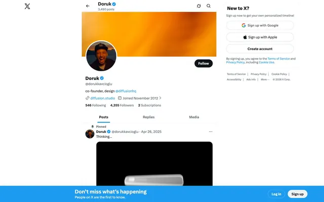
Preview image. Unlock full-res
High-contrast information stream
Color palette
Primary action background, interactive icons, active links, and brand accents. This color defines interactive states
Primary text, strong headings, critical borders, and UI elements requiring highest contrast
Page backgrounds, card surfaces, and primary button text
Muted captions, helper text, and de-emphasized UI labels. Do not promote it to the primary CTA color
Subtle background for UI elements, light button backgrounds, and card borders
Hairline borders, subtle dividers, and inactive form elements
Body text for slightly softer contrast than Midnight Ink, and secondary interactive text
Light supporting surface for subtle backgrounds and section separation. Do not promote it to the primary CTA color
Background for subtle, low-prominence buttons
Inactive navigation text
Typography
- Weights
- 400, 700
- Sizes
- 15px
- Line height
- 1.2
- Fallback
- Georgia
Fallback serif font used sparingly, primarily in system-level or legacy contexts. Its presence suggests a system font dependency or specific legacy content.
- Weights
- 400, 500, 700, 800
- Sizes
- 11px, 13px, 14px, 15px, 20px, 23px
- Line height
- 0.8, 1.09, 1.14, 1.2, 1.22, 1.23, 1.33
- Fallback
- Inter
The primary brand typeface, characterized by its range of weights for flexible information hierarchy. Used for almost all UI text, headings, and body content, especially for ensuring consistent brand voice beyond system fonts.
Spacing & shape
Elevation
Components
Background: transparent (rgba(0, 0, 0, 0)), Text: Midnight Ink (#000000). No visible border.
Background: rgba(15, 20, 25, 0.75), Text: Midnight Ink (#000000). Radius: 9999px.
Background: transparent (rgba(0, 0, 0, 0)), Text: Midnight Ink (#000000), Border: 1px solid Border Silver (#cfd9de). Radius: 9999px.
Background: Puck Blue (#1d9bf0), Text: Canvas White (#ffffff). Radius: 9999px. Padding: 4px vertical, 16px horizontal (inferred typical button padding).
Background: transparent (rgba(0, 0, 0, 0)), no shadow. Horizontal padding: 16px.
Background: Canvas White (#ffffff). Radius: 9999px.
Background: Canvas White (#ffffff). Radius: 16px.
Background: Puck Blue (#1d9bf0). Padding: 40px bottom (inferred from usage). Text: Canvas White (#ffffff).
Guidelines
- Use Midnight Ink (#000000) for all primary text and headings to ensure maximum contrast.
- Apply Puck Blue (#1d9bf0) exclusively for primary action buttons, active states, and brand iconography.
- Utilize 9999px border-radius for all interactive buttons, profile avatars, and social links to maintain a fluid, rounded aesthetic.
- Maintain a clear visual hierarchy with Canvas White (#ffffff) for primary content surfaces and Mist (#eff3f4) for subtle background distinctions.
- Enforce a base unit of 4px for all spacing decisions, translating to common increments like 4px, 8px, 12px, and 16px for clear rhythm.
- Employ the TwitterChirp font for all UI elements, utilizing its varying weights (400, 500, 700, 800) to indicate hierarchy without size changes where appropriate.
- Frame content within a pageMaxWidth of 1070px for optimal readability and balanced composition on larger screens.
- Do not introduce new chromatic colors; adhere strictly to the Puck Blue (#1d9bf0) as the sole accent color.
- Avoid heavy shadows or gradients; the system prefers subtle elevation with Whisper Gray (#e0e4e7) or thin Border Silver (#cfd9de) outlines.
- Do not deviate from the specified font sizes and line heights for TwitterChirp to preserve the compact and high-density information display.
- Never use Times or any other serif font for primary UI text; it is reserved for system fallback or specific legacy contexts.
- Avoid applying large, decorative radii to content cards unless specifically defined, maintaining a 16px radius for standard content blocks.
- Do not cluster elements excessively; ensure a minimum elementGap of 4px to maintain visual breathing room.
- Resist using bold headlines universally; instead, leverage TwitterChirp's range of weights and the designated type scale to create nuanced visual hierarchy.
About this system
ShowHide
X (formerly Twitter) employs a high-contrast, functionally driven design system built on a monochrome base with a singular, vivid blue accent. Content takes precedence, rendered against crisp white and subtle gray surfaces, defined by thin borders and minimal elevation. Typography is compact and precise, maintaining a dense information flow, while rounded corners provide a subtle approachability to functional elements like buttons and cards.
The page structure follows a max-width contained model of 1070px, with content centered. The hero section is characterized by a prominent user banner, followed by a profile header and a tabbed navigation. Content sections (feed items) flow vertically, each acting as a distinct card with internal padding. A sticky global navigation bar is present at the bottom of the viewport, providing persistent access to primary actions. The layout is dense, prioritizing information display with compact vertical rhythm, rather than spacious arrangements.
This system primarily uses embedded media (videos, images) and user avatars, often unstyled or with default system treatments. Product screenshots and user-generated content are showcased directly. Icons are flat, monochrome, and filled, primarily in Slate Gray (#536471) or Puck Blue (#1d9bf0) for functional indicators. The density of imagery is high, with media often taking up significant visual space within the content stream, contributing to an information-rich visual experience rather than a decorative one.
Reminiscent of Bluesky, LinkedIn, Reddit (Light Mode), Facebook (Light Mode).
# X (formerly Twitter) — Style Reference
> High-contrast information stream

**Theme:** light

**Site:** https://create.video

X (formerly Twitter) employs a high-contrast, functionally driven design system built on a monochrome base with a singular, vivid blue accent. Content takes precedence, rendered against crisp white and subtle gray surfaces, defined by thin borders and minimal elevation. Typography is compact and precise, maintaining a dense information flow, while rounded corners provide a subtle approachability to functional elements like buttons and cards.

## Tokens — Colors

| Name | Value | Token | Role |
|------|------|------|------|
| Puck Blue | `#1d9bf0` | `--color-puck-blue` | Primary action background, interactive icons, active links, and brand accents. This color defines interactive states |
| Midnight Ink | `#000000` | `--color-midnight-ink` | Primary text, strong headings, critical borders, and UI elements requiring highest contrast |
| Canvas White | `#ffffff` | `--color-canvas-white` | Page backgrounds, card surfaces, and primary button text |
| Slate Gray | `#536471` | `--color-slate-gray` | Muted captions, helper text, and de-emphasized UI labels. Do not promote it to the primary CTA color |
| Mist | `#eff3f4` | `--color-mist` | Subtle background for UI elements, light button backgrounds, and card borders |
| Border Silver | `#cfd9de` | `--color-border-silver` | Hairline borders, subtle dividers, and inactive form elements |
| Near Black | `#0f1419` | `--color-near-black` | Body text for slightly softer contrast than Midnight Ink, and secondary interactive text |
| Whisper Gray | `#e0e4e7` | `--color-whisper-gray` | Light supporting surface for subtle backgrounds and section separation. Do not promote it to the primary CTA color |
| Shadowed Button | `#4b4f53` | `--color-shadowed-button` | Background for subtle, low-prominence buttons |
| Muted Navigation Text | `#829aab` | `--color-muted-navigation-text` | Inactive navigation text |

## Tokens — Typography

### Times
- **Substitute:** Georgia
- **Weights:** 400, 700
- **Sizes:** 15px
- **Line height:** 1.2
- **Role:** Fallback serif font used sparingly, primarily in system-level or legacy contexts. Its presence suggests a system font dependency or specific legacy content.

### TwitterChirp
- **Substitute:** Inter
- **Weights:** 400, 500, 700, 800
- **Sizes:** 11px, 13px, 14px, 15px, 20px, 23px
- **Line height:** 0.8, 1.09, 1.14, 1.2, 1.22, 1.23, 1.33
- **Role:** The primary brand typeface, characterized by its range of weights for flexible information hierarchy. Used for almost all UI text, headings, and body content, especially for ensuring consistent brand voice beyond system fonts.

## Tokens — Type Scale

Major Third (1.25) from 11px base.

| Role | Size | Line height | Letter spacing |
|------|------|------|------|
| caption | 11px | 1.23 | — |
| body-lg | 15px | 1.2 | — |
| heading | 20px | 1.09 | — |
| display | 23px | 0.8 | — |

## Tokens — Spacing

- **Max width:** 1070px
- **Section gap:** 40px
- **Card padding:** 16px
- **Element gap:** 4px

## Tokens — Radius

- **Buttons:** 9999px
- **Cards:** 16px
- **avatars:** 9999px
- **links:** 9999px
- **other:** 4px

## Tokens — Elevation

- **Button:** `rgba(101, 119, 134, 0.2) 0px 0px 8px 0px, rgba(101, 119, 134, 0.25) 0px 1px 3px 1px`

## Layout

The page structure follows a max-width contained model of 1070px, with content centered. The hero section is characterized by a prominent user banner, followed by a profile header and a tabbed navigation. Content sections (feed items) flow vertically, each acting as a distinct card with internal padding. A sticky global navigation bar is present at the bottom of the viewport, providing persistent access to primary actions. The layout is dense, prioritizing information display with compact vertical rhythm, rather than spacious arrangements.

## Imagery

This system primarily uses embedded media (videos, images) and user avatars, often unstyled or with default system treatments. Product screenshots and user-generated content are showcased directly. Icons are flat, monochrome, and filled, primarily in Slate Gray (#536471) or Puck Blue (#1d9bf0) for functional indicators. The density of imagery is high, with media often taking up significant visual space within the content stream, contributing to an information-rich visual experience rather than a decorative one.

## Components

### Text Only Button
*Neutral, interactive text-based button.*

Background: transparent (rgba(0, 0, 0, 0)), Text: Midnight Ink (#000000). No visible border.

### Subtle Text Button
*Subtly darker text button for secondary actions.*

Background: rgba(15, 20, 25, 0.75), Text: Midnight Ink (#000000). Radius: 9999px.

### Outlined Button
*Ghost button with a neutral border.*

Background: transparent (rgba(0, 0, 0, 0)), Text: Midnight Ink (#000000), Border: 1px solid Border Silver (#cfd9de). Radius: 9999px.

### Primary Action Button
*Calls to action with brand emphasis.*

Background: Puck Blue (#1d9bf0), Text: Canvas White (#ffffff). Radius: 9999px. Padding: 4px vertical, 16px horizontal (inferred typical button padding).

### Ghost Card
*Content container with minimal visual separation from the background.*

Background: transparent (rgba(0, 0, 0, 0)), no shadow. Horizontal padding: 16px.

### Profile Header Card
*Card with pronounced rounded corners for profile details.*

Background: Canvas White (#ffffff). Radius: 9999px.

### Feed Item Card
*Standard post or feed item container.*

Background: Canvas White (#ffffff). Radius: 16px.

### Global Navigation Bar
*Sticky bottom bar for primary actions.*

Background: Puck Blue (#1d9bf0). Padding: 40px bottom (inferred from usage). Text: Canvas White (#ffffff).

## Guidelines

### Do

- Use Midnight Ink (#000000) for all primary text and headings to ensure maximum contrast.
- Apply Puck Blue (#1d9bf0) exclusively for primary action buttons, active states, and brand iconography.
- Utilize 9999px border-radius for all interactive buttons, profile avatars, and social links to maintain a fluid, rounded aesthetic.
- Maintain a clear visual hierarchy with Canvas White (#ffffff) for primary content surfaces and Mist (#eff3f4) for subtle background distinctions.
- Enforce a base unit of 4px for all spacing decisions, translating to common increments like 4px, 8px, 12px, and 16px for clear rhythm.
- Employ the TwitterChirp font for all UI elements, utilizing its varying weights (400, 500, 700, 800) to indicate hierarchy without size changes where appropriate.
- Frame content within a pageMaxWidth of 1070px for optimal readability and balanced composition on larger screens.

### Don't

- Do not introduce new chromatic colors; adhere strictly to the Puck Blue (#1d9bf0) as the sole accent color.
- Avoid heavy shadows or gradients; the system prefers subtle elevation with Whisper Gray (#e0e4e7) or thin Border Silver (#cfd9de) outlines.
- Do not deviate from the specified font sizes and line heights for TwitterChirp to preserve the compact and high-density information display.
- Never use Times or any other serif font for primary UI text; it is reserved for system fallback or specific legacy contexts.
- Avoid applying large, decorative radii to content cards unless specifically defined, maintaining a 16px radius for standard content blocks.
- Do not cluster elements excessively; ensure a minimum elementGap of 4px to maintain visual breathing room.
- Resist using bold headlines universally; instead, leverage TwitterChirp's range of weights and the designated type scale to create nuanced visual hierarchy.

## Agent Prompt Guide

Quick Color Reference:
text: #000000
background: #ffffff
border: #cfd9de
accent: #1d9bf0
primary action: #1d9bf0 (filled action)

Example Component Prompts:
1. Create a Primary Action Button: #1d9bf0 background, #000000 text, 9999px radius, compact pill padding. Use this filled treatment for the main CTA.
2. Design a user profile card: Background Canvas White (#ffffff), radius 16px. Include a heading in Midnight Ink (#000000), TwitterChirp 800 weight, 23px size, 0.8 lineHeight. Add secondary text in Slate Gray (#536471), TwitterChirp 400 weight, 14px size, 1.22 lineHeight.
3. Make a neutral ghost button with a Border Silver (#cfd9de) outline: Background transparent, text Midnight Ink (#000000), border 1px solid #cfd9de, radius 9999px. Use TwitterChirp 500 weight, 15px size, 1.2 lineHeight.
More like this







Keep what you find
A free account saves references to boards and can send you a weekly email of picks based on what you save.
To see every result, go Pro.