Preview image. Unlock full-res
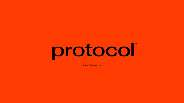
Bold minimalist brand identity for Protocol café featuring a striking orange-red background with clean sans-serif logotype and baseline tagline.
Summary
A bold minimalist café brand identity using a bright orange-red background with black sans-serif logotype and a descriptive tagline in smaller type, creating high visual impact through color contrast.
Visual description
The composition occupies the full rectangular frame with a solid burnt-orange or tomato-red background (RGB-like intensity). Centered in the upper-middle area is the word "protocol" in a clean, modern sans-serif typeface, rendered in pure black. Directly below it, in a much smaller black sans-serif, sits the tagline "Scientifically Natural". The type is perfectly centered and kerned, with generous white space surrounding all elements. The color and type treatment are entirely flat, with no gradients, shadows, or dimensional effects.
Key takeaway
Monochromatic typography on a single bold background color creates instant memorability. A descriptive tagline (beyond just the business name) communicates brand positioning efficiently. The warm, nearly neon orange reads as energetic and forward-thinking—appropriate for a contemporary café.
Reuse notes
Excellent reference for food and beverage brands, tech companies, or health-focused businesses wanting bold, approachable identity. The flat, solid-color approach is web-native and scales instantly (favicon, t-shirt, sign, app). The warmth of the orange contrasts with "scientifically natural," suggesting premium or specialized ingredients. Works as both a primary brand application and a simplified lockup for restricted-space contexts.
More like this





Keep what you find
A free account saves references to boards and can send you a weekly email of picks based on what you save.
To see every result, go Pro.