Preview image. Unlock full-res
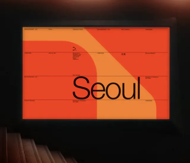
Minimalist identity system for Seoul using warm orange-to-tan gradient blocks with a clean sans-serif wordmark center.
Summary
A minimalist city brand identity using a warm orange-to-tan gradient composed of geometric blocks, anchoring a sans-serif wordmark in the center.
Visual description
The wordmark sits centered within a rectangular box featuring five horizontal color bands that create a gradient from bright red-orange (#E84626) at top-left through peachy tan (#ED843B) in the center, with a dark brown-black (#090908) band cutting diagonally through the composition. The geometric blocks are arranged with sharp, clean lines, some bands narrower than others, creating visual rhythm through color and proportion. The wordmark "Seoul" appears in a black or very dark sans-serif (likely condensed or regular weight) centered over the color gradient system. Small text elements appear in the gradient blocks suggesting scale or measurement guides. The design is displayed against a dark gallery background (visible in the photograph of the branded application), showing how the identity appears when applied to physical or environmental media.
Key takeaway
The gradient system is structured modularly using pure geometric blocks rather than smooth color transitions, giving it a crisp, corporate feel while still feeling warm and approachable. The centered wordmark placement over the patterned background creates a strong visual anchor. The ratio and proportion of each colored band creates visual interest without complexity. The system appears flexible, suggesting the gradient blocks could be rearranged or cropped differently depending on application context (web, print, signage).
Reuse notes
Ideal for city, tourism, or location-based brands seeking warm, confident, modern identity. The warm orange-tan palette conveys hospitality and energy without feeling playful. The geometric block system translates well across media (digital, signage, environmental). The pure sans-serif wordmark reads clearly at any scale. Best suited for brands needing flexibility to adapt the gradient system to rectangular constraints (horizontal signage, website headers, book covers, packaging). Works particularly well for travel, hospitality, or cultural institutions.
More like this




Keep what you find
A free account saves references to boards and can send you a weekly email of picks based on what you save.
To see every result, go Pro.