Preview image. Unlock full-res
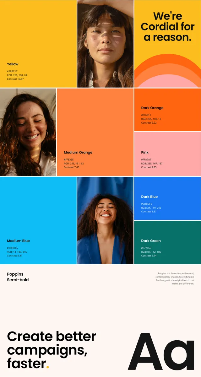
A marketing-brand color system laid out as a mosaic of saturated color blocks and warm portrait photography, captioned with named swatches and hex specs.
Summary
A brand color board for a campaign tool, built from a tight mosaic of saturated color tiles interleaved with cropped portrait photos. Each color block is labeled with a name (Yellow, Dark Orange, Pink, Medium Blue, Dark Green) plus hex and contrast specs.
Visual description
The top two-thirds is a checkerboard of equal-sized squares: bright yellow, two oranges, soft pink, sky blue and dark green color fields alternating with warm-lit photographs of smiling people. Headline "We're Cordial for a reason." sits in a yellow tile in a heavy sans, with a stacked-arc sunburst graphic beneath it. Each color tile carries a small caption block giving the swatch name, hex value and contrast ratio. A "Poppins / Semi-bold" type note sits lower left. The bottom band switches to a cream field with "Create better campaigns, faster." in bold black sans on the left and an enormous black "Aa" specimen on the right. The overall feel is high-energy, optimistic, sunny.
Key takeaway
Treating the color palette and the photo grid as one interlocking mosaic, so the brand's colors and its people read as a single system. The per-swatch caption with hex and contrast ratio is a tidy, accessibility-aware way to spec a palette inside a layout.
Reuse notes
Good reference for a campaign or martech brand that wants warmth and energy, or for any palette page where you want swatches to feel alive rather than abstract. The checkerboard needs strong, consistently lit photography to hold up. Pairs naturally with a geometric sans like Poppins.
More like this



Keep what you find
A free account saves references to boards and can send you a weekly email of picks based on what you save.
To see every result, go Pro.