Preview image. Unlock full-res
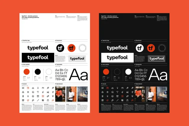
Two-page identity system for Typefool showing logotype, primary brand mark, color palette, typography system, icon set, and style application examples on light and dark backgrounds.
Summary
Left and right page views of Typefool's identity guidelines presenting logotype variations, brand marks, and applications in parallel light and dark versions.
Visual description
Two single-page layout templates shown side-by-side against a warm orange background. Each page has an identical structure: header with "Typefool - Identity systems, One page branding guidelines, Version 0.1." Four quadrants below: (1) Typefool logotype section showing a serif wordmark in black, a circular primary mark in white and warm orange, and a secondary outline circle version. (2) Brandmark section with the orange-filled circular mark and black-filled primary variations. (3) Color palette showing three color swatches (warm orange, black, and outlined circle) with hex codes below; typography showing sans-serif alphabet (Aa Bb Cc, digits 0123456, and symbols 789+@:). (4) Iconset section displaying a 4-row grid of simplified line-drawn icons in monochrome, followed by style element examples: three photographs (hand holding an orange object, portrait wearing orange, interior with orange accent) with caption blocks below. The left page is light (white/cream background with black text), the right page is dark (black background with white/orange text and inverted photography tones). Both share identical layout structure and information architecture.
Key takeaway
The one-page format that compresses identity, type, color, icons, and real-world examples into a grid without waste. The symmetrical light/dark dual-version approach showing how the system adapts; each version is fully functional, not a forced gimmick. The use of consistent warm orange as the accent color across both versions, providing a memorable linking element. The icon set showing a scalable mark system that remains readable at small sizes while maintaining character.
Reuse notes
Excellent template for design agencies or creative studios documenting their own brand or presenting client work. The one-page constraint forces clear hierarchy and prioritization, making it useful for print, PDF, or presentation formats. The warm orange is bold and memorable but can feel trendy; test longevity with stakeholders. The icon set shown here is generic but well-executed; adapt or replace with domain-specific icons (e.g., user, settings, link, export) relevant to your brand or product.
More like this








Keep what you find
A free account saves references to boards and can send you a weekly email of picks based on what you save.
To see every result, go Pro.