Preview image. Unlock full-res
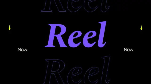
A violet italic serif wordmark reading Reel sits centered on black, echoed by larger ghosted outline copies above and below for a layered, depth-stacked title treatment.
Summary
A typographic title card built around the word "Reel" set in a bright violet italic serif, stacked between two larger ghosted outline repeats of the same word for a sense of receding depth.
Visual description
Pure black field, landscape format. The central word "Reel" is set in a high-contrast italic serif, solid violet, optically centered. Directly above and below it sit two oversized copies of the same word rendered as thin violet outlines only, cropped by the top and bottom edges so they read as faint echoes behind the solid one. Small yellow four-point sparkle marks flank the center on the left and right. The word "New" in plain white sans-serif sits low on both the left and right margins, balancing the composition. Generous negative space keeps the focus on the repeated word.
Key takeaway
The three-deep stacking of one word, solid in front and outlined behind, to fake depth and motion in a flat still. Pairing a single bright accent hue against black, then dropping in tiny yellow sparkle glyphs as the only secondary color, keeps it disciplined while still feeling alive.
Reuse notes
Good for a launch or "new release" title slide, a video thumbnail, or a music or media brand wanting a moody, premium type-led look. The outline-behind-solid trick needs a high-contrast serif to read; it flattens with a thin sans. Works only on dark backgrounds.
More like this



Keep what you find
A free account saves references to boards and can send you a weekly email of picks based on what you save.
To see every result, go Pro.