Preview image. Unlock full-res
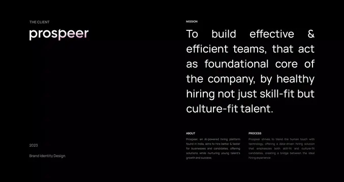
A black brand-deck intro page pairing a soft pink-gradient lowercase Prospeer wordmark with an oversized white mission statement and small labelled About and Process columns.
Summary
A dark brand-deck intro page for a hiring platform, anchored by a lowercase "prospeer" wordmark that fades from white into a soft pink gradient on the right half of the word.
Visual description
Pure black background split into two columns. The left column carries a small grey "THE CLIENT" label, the gradient wordmark beneath it, and at the bottom a muted "2023 / Brand Identity Design" caption. The right column leads with a "MISSION" label and a large white sans-serif statement set in a wide justified block where word-spacing stretches each line edge to edge. Below the mission sit two small labelled columns, "ABOUT" and "PROCESS", in low-contrast grey body copy. The hierarchy is driven entirely by scale and brightness, no rules or boxes.
Key takeaway
The justified mission paragraph that forces flush left and right edges, turning body copy into a clean rectangular slab. Also the partial gradient on the wordmark, color applied to only the trailing half of the word so the brand mark feels alive without a separate logo graphic.
Reuse notes
A strong template for a case-study or about page intro where one bold statement should dominate and supporting copy recedes into labelled grey columns. Works only on a true black background; the gradient wordmark needs a dark field to glow.
More like this





Keep what you find
A free account saves references to boards and can send you a weekly email of picks based on what you save.
To see every result, go Pro.