Preview image. Unlock full-res
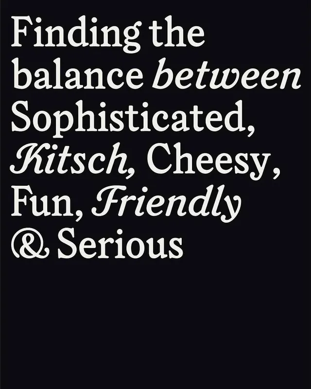
A cream serif statement set ragged-left on black, mixing upright roman and swashy italic cuts of the same typeface to dramatize a list of brand-tone words.
Summary
A typographic brand-tone slide that reads "Finding the balance between Sophisticated, Kitsch, Cheesy, Fun, Friendly & Serious," using upright and swash-italic cuts of one serif to act out the words themselves.
Visual description
Large cream type fills the upper two thirds of a near-black field, set ragged on the left and tightly leaded so lines almost touch. The typeface is a high-contrast serif; key descriptor words ("between," "Kitsch," "Friendly") switch into a flourished italic with calligraphic swashes, while the structural words stay in a sober upright roman. That roman-versus-italic alternation visually performs the copy's argument about balancing sophisticated and playful. A decorative ampersand anchors the final line. The lower third is left empty, giving the block weight and letting the black breathe.
Key takeaway
Using two styles of the same family, upright and swash-italic, to make the words demonstrate their own meaning rather than describing it. The tight negative leading turns a list into a single dense type object.
Reuse notes
Ideal for a brand guidelines "tone of voice" or "personality" page, or an editorial cover. Works only with a serif that ships a genuinely expressive italic with swashes; a plain oblique would kill the effect. Keep the palette restrained so the type does all the talking.
More like this



Keep what you find
A free account saves references to boards and can send you a weekly email of picks based on what you save.
To see every result, go Pro.