Preview image. Unlock full-res
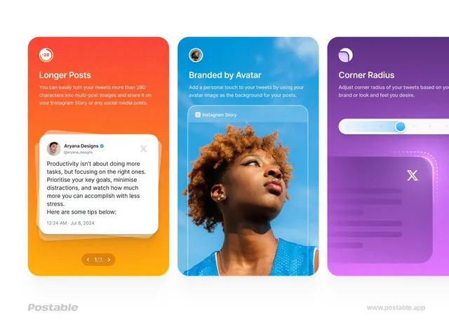
Three vertical gradient feature cards for the Postable app, each pairing a bold headline with a UI demo, set on white with the wordmark and URL.
Summary
A three-up marketing layout for the Postable app, each tall rounded card a different gradient with a feature title and an embedded UI demo, branded with the Postable wordmark and www.postable.app.
Visual description
Three vertical cards with heavily rounded corners sit side by side on a clean white canvas. The left card runs an orange-to-amber gradient titled Longer Posts and shows a white tweet card with a 1/3 carousel pager. The center card is a sky-blue photographic gradient titled Branded by Avatar, with a portrait photo inside an Instagram Story frame demoing avatar-based backgrounds. The right card is a violet-to-magenta gradient titled Corner Radius, demonstrating a draggable slider control above a rounded UI block. Each card uses a white bold headline over lighter body copy, with a small circular avatar badge top-left. Footer corners carry the grey Postable wordmark and the site URL.
Key takeaway
Encoding each product feature as a self-contained gradient card that literally demonstrates the feature inside it (the carousel card shows a carousel, the radius card shows a slider). The shared layout grammar, badge top-left, headline, demo below, lets wildly different gradients still read as one set.
Reuse notes
A clean template for app or SaaS feature announcements, app-store screenshots, or a landing-page feature strip. The formula scales to any number of cards. Keep the gradients saturated but the typography plain so the UI demos stay the focus; works equally as static social posts or a swipeable carousel.
More like this




Keep what you find
A free account saves references to boards and can send you a weekly email of picks based on what you save.
To see every result, go Pro.