Preview image. Unlock full-res
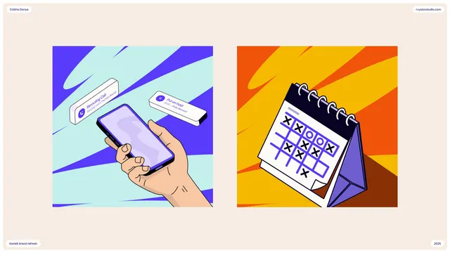
Twin flat-design illustrations showing product interaction and scheduling, rendered in 3D isometric perspective with complementary gradient backgrounds and branded collateral treatments.
Summary
A pair of vibrant flat-design illustrations in isometric perspective demonstrating a mobile app interface and desk calendar product, each set against a bold diagonal-stripe gradient background with branded collateral (labeled packaging and desk calendar stand).
Visual description
Cream-colored page layout with two square illustrations side by side. Left illustration: a hand holding a smartphone displaying a purple-and-white interface, framed by a cyan-to-purple gradient with diagonal white stripes, accompanied by branded packaging tubes and boxes. Right illustration: a three-dimensional calendar stand in white and purple displaying a tic-tac-toe grid, set within an orange-to-yellow gradient with red diagonal stripes, flanked by branded packaging. Both illustrations use simple geometric shapes, clean outlines, and bold color blocking. Header text reads "Collins Doney" (left) and URL "roylinestudio.com" (right); a date stamp "2025" appears at bottom right. The overall style prioritizes clarity, functional design, and playful brand expression through color and form.
Key takeaway
The split-composition layout presenting two complementary concepts (digital and physical product) with cohesive branding. Bold diagonal gradient backgrounds create visual energy and separate each scene without compartmentalizing them. The hand-holding-device poses human interaction directly into the design rather than showing a product in isolation. Color palette and stripe patterns unify disparate elements into a recognizable brand asset suite.
Reuse notes
Effective for SaaS, mobile app, or software product marketing materials. The isometric perspective feels current and accessible without being trendy. Works well as collateral asset kit, website illustration, or landing-page hero. The generous negative space and clean line work keep illustrations legible at various scales. Best paired with sans-serif typography. Avoid overly detailed backgrounds; this style trades realism for clarity and brand recognition.