Preview image. Unlock full-res
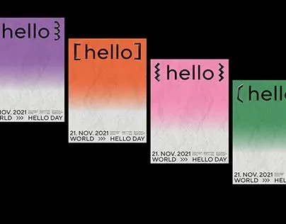
A four-poster set for World Hello Day, each pairing a different bracket-wrapped 'hello' with a vertical color gradient fading into a creased paper texture.
Summary
A campaign of four portrait posters for "World Hello Day" (21 Nov 2021), shown lined up on a white wall. Each poster keeps the same layout but swaps the gradient color and the bracket style wrapping the word "hello", so the set reads as one identity in four variants.
Visual description
Four staggered vertical posters, each a top-down color gradient that bleeds from a saturated hue at the top into a near-white, visibly creased paper texture at the bottom. The hero word "hello" sits centered in the upper third, enclosed in a different bracket pair per poster: braces, square brackets, and other framing marks. The lower third carries small justified footer copy with "21. NOV. 2021", "WORLD", and "HELLO DAY" set in a tidy left-and-right metadata block. Colorways run purple, orange, pink, and green; layout, type, and crease texture stay identical across all four.
Key takeaway
Lock one rigid layout and one type treatment, then vary only the gradient hue and a single graphic detail (here the bracket style) to generate a whole poster system fast. The wrinkled-paper fade at the bottom of each gradient adds tactile depth and grounds the small footer type. Bracketing the hero word turns a plain greeting into a logo-like mark.
Reuse notes
A template for awareness days, festival lineups, or any campaign that needs many on-brand variants from one master. Pairs well with a clean grotesque and a justified metadata footer. The gradient-into-texture trick depends on a good paper scan; a flat gradient loses the tactile payoff.
More like this
Keep what you find
A free account saves references to boards and can send you a weekly email of picks based on what you save.
To see every result, go Pro.