Preview image. Unlock full-res
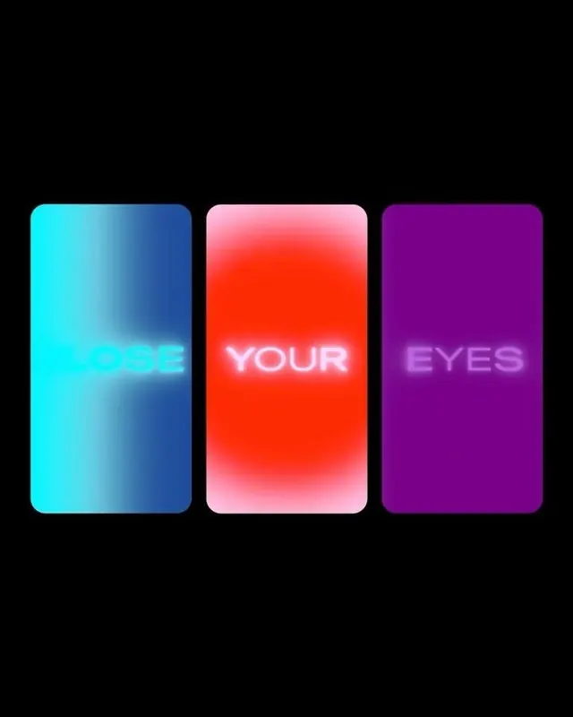
Three vibrant gradient cards with glowing white text on black, each card shifting from cyan to magenta, creating a high-contrast neon aesthetic.
Summary
Three vibrant gradient cards with glowing white text on black, each card shifting from cyan to magenta, creating a high-contrast neon aesthetic.
Visual description
Black background with three equally-spaced vertical cards. Each has a rounded-rectangle shape with smooth radial gradients: left card (cyan to deep blue), center card (red to pink), right card (purple to magenta). White sans-serif text is centered on each card ("LOSE YOUR EYES"), with soft diffused halos creating a glowing neon effect. Cards are evenly distributed horizontally with subtle shadows suggesting depth.
Key takeaway
The soft glow behind each text creates dimensionality on flat cards without complexity. The three-color progression (cool to warm to cool) guides the eye and suggests rhythm or narrative. Gradients are smooth and directional, not banded.
Reuse notes
Ideal for marketing campaigns, product launches, or digital experiences targeting younger audiences. The saturation and glow work at any size but are most impactful at large scales. Avoid using all three simultaneously in constrained layouts; single cards translate well to CTA buttons or hero sections.
More like this



Keep what you find
A free account saves references to boards and can send you a weekly email of picks based on what you save.
To see every result, go Pro.