Preview image. Unlock full-res
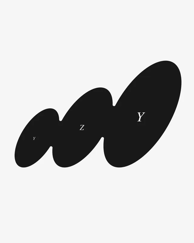
A single black ink-blob form of three fused ovals climbing diagonally, each lobe carrying a small white serif letter at a different scale.
Summary
A solid black organic form built from three overlapping ovals that fuse into one rising diagonal blob, with a small white serif letter knocked out of each lobe at escalating sizes.
Visual description
On a near-white field, one continuous black shape sits low-left and tilts up toward the upper-right corner. It reads as three egg-like ovals joined by soft pinched waists, the rightmost the largest and most tilted, giving the whole form a sense of forward motion. Inside the lobes, three white serif letters appear at deliberately mismatched scales: a tiny Y in the small left lobe, a medium Z in the center, and a large Y in the dominant right oval. The serif type, delicate against the heavy mass, is the only fine detail; everything else is pure silhouette and generous surrounding space.
Key takeaway
Reversing small refined serif letters out of a heavy organic blob, the contrast of fluid mass against precise type is the whole idea. Scaling the three letters differently turns a static shape into something with rhythm and implied reading order, guiding the eye up the diagonal.
Reuse notes
A flexible art-directed mark for an editorial brand, art project, or cultural identity that wants to feel expressive rather than corporate. The blob can flex to any number of lobes and letters. Relies on strong figure-ground contrast, so keep it single-color on a clean ground; the small serifs need enough size to stay legible in print.
More like this

Keep what you find
A free account saves references to boards and can send you a weekly email of picks based on what you save.
To see every result, go Pro.