Preview image. Unlock full-res
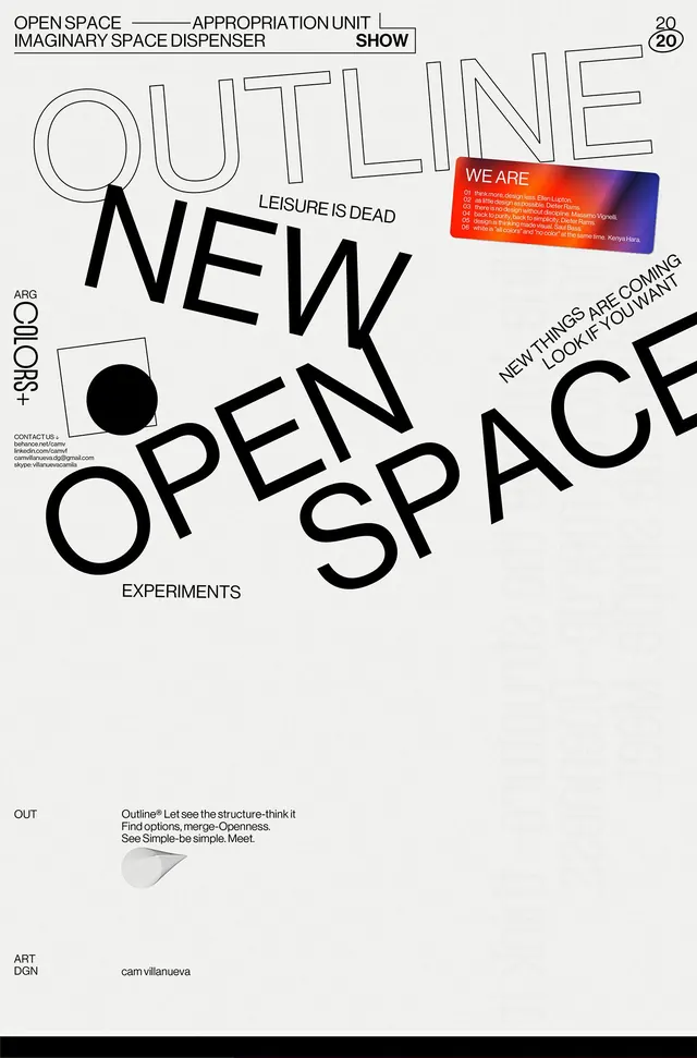
Conceptual typographic poster for Openspace/Show using expansive sans-serif letterforms, geometric line accents, and a single solid circle as a minimalist branding element.
Summary
A minimalist typographic poster where oversized sans-serif letters dominate the composition, punctuated by thin geometric line accents and a single black circle as a branding device.
Visual description
Off-white background with black serif and sans-serif typography arranged asymmetrically. Large, carefully letterspaced headlines include "OPENSPACE," "OUT," and "NEW OPEN SPACE" layered in outline and solid typefaces. Thin geometric lines and right angles frame sections of text. A solid black circle appears in the lower-left quadrant, functioning as a minimal logo or tonal anchor. Small abbreviations and text appear in corners: "ABG COLOR CONCEPTS" upper left, "OUT EXPERIMENTS" lower center, "ART DGN" lower left with "Cam Villanueva" credit. A small gradient badge in red and blue (labeled "WE ARE") appears in the upper right with white text describing the brand or initiative.
Key takeaway
The restraint of using a single circle as the entire logo identity while letting typography carry the brand expression. The layering of outline and solid letterforms creates depth and movement without decoration. The asymmetrical placement and thin geometric rules create visual interest while maintaining a serious, intellectual tone.
Reuse notes
Excellent reference for avant-garde or design-industry branding that prioritizes typographic expression over figurative marks. The technique of using outline vs. solid weight variations in display type works well for posters, exhibitions, or conceptual identities. Best suited to audiences comfortable with minimal, intellectual design.
More like this




Keep what you find
A free account saves references to boards and can send you a weekly email of picks based on what you save.
To see every result, go Pro.