Preview image. Unlock full-res
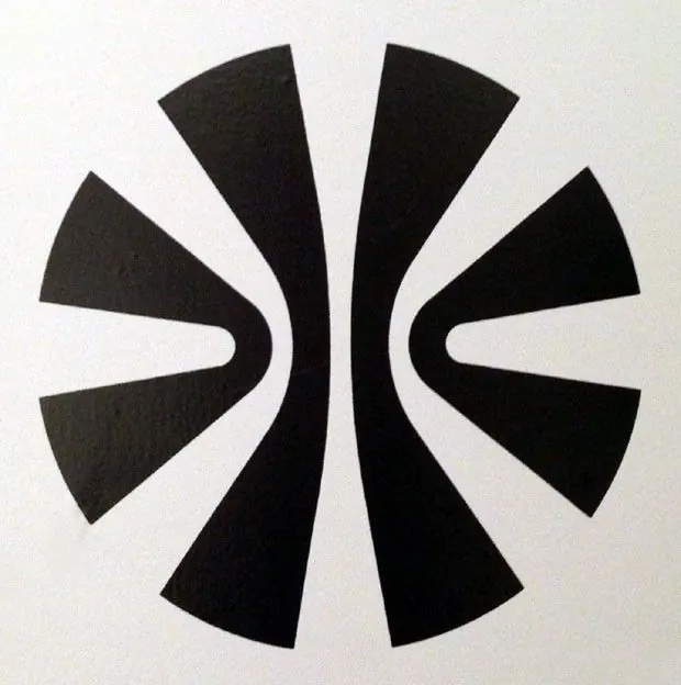
A black circular logo mark split into radiating wedges, with two mirrored arrow notches carved into the center to form a symmetrical negative-space focal point.
Summary
A solid-black circular mark cut into radiating wedge segments, with two mirrored chevron notches biting into the middle so the negative space reads as a pair of opposing arrowheads. The symmetry is the whole point.
Visual description
The mark fills a roughly square, off-white printed sheet, photographed so faint paper texture shows in the ink. Eight black wedges radiate from the center like a stylized burst or ball, the wider blades at top and bottom, slimmer ones at the sides. At the core, two arrow-shaped white notches face each other left and right, leaving a thin vertical seam of white down the middle. The form is bilaterally symmetrical and reads simultaneously as a sphere, a compass burst, and two inward-pointing arrows.
Key takeaway
Carve the focal meaning out of negative space rather than adding it, here the central white arrows are absences in a solid disc. Varying the wedge widths around the circle keeps a radial mark from looking like a generic pie or sunburst and gives it directional tension.
Reuse notes
A confident choice for an abstract corporate or tech identity that wants a single bold symbol with no wordmark dependency. Pure black on off-white keeps it versatile and reproducible at any size. The dense radial form can fill in at very small sizes, so test the central notches survive when scaled down.
More like this



Keep what you find
A free account saves references to boards and can send you a weekly email of picks based on what you save.
To see every result, go Pro.