Preview image. Unlock full-res
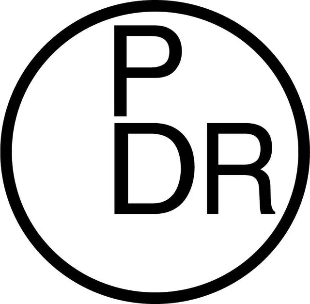
A circular monogram that stacks a P above a DR pairing in a light monoline geometric sans, set off-center inside a thin ring so the letters lean to the right of the enclosure.
Summary
A circular monogram stacking the initials P over DR in a light, even-stroke geometric sans, positioned to the right of center inside a thin ring so the type and its enclosure feel deliberately unbalanced.
Visual description
Black on white. A capital "P" sits on the upper line and "DR" sits directly beneath it, both in a clean monoline geometric sans with uniform stroke weight, generous apertures, and a slightly spurred R. The two-line lockup is nudged right of the circle's center rather than perfectly centered, leaving a wider crescent of white on the left. A single thin keyline circle, of a lighter weight than the letters, encloses everything with comfortable margin. Strictly black, white, and an implied mid-grey; no fill, gradient, or ornament.
Key takeaway
Stacking three initials as P / DR (one over two) instead of running them inline keeps the mark compact and circular. The intentional off-center placement inside the ring adds a quiet tension that a dead-centered lockup would not, while the monoline weight keeps it legible down to favicon size.
Reuse notes
A safe, scalable choice for a studio, firm, or personal brand with two-to-three initials that needs a tidy badge for avatars, stamps, and app icons. The monoline weight reproduces cleanly at small sizes and in single-color print. Swap the off-center placement for centered if the brand wants to read more conservative.