Preview image. Unlock full-res
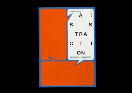
A talk poster set on a deep blue-framed rectangle, where an oversized stacked title (ABSTRACTION, two letters per line) sits in a white speech-bubble panel overlapping two orange rounded blocks.
Summary
A talk-series poster grid where three distinct speech-bubble shapes (two orange rounded blocks with tails and one white panel) form the background structure while a four-color palette (cobalt blue, orange, black, cream) repeats the motif across the frame.
Visual description
An off-white rectangular poster with a thin cobalt-blue border. Two flat orange rounded rectangles with diagonal tails function as speech bubbles; a taller one occupies the left edge and a shorter, wider one spans the bottom. A white speech-bubble panel overlaps from the upper right, creating a staggered conversation-like composition. Inside the white bubble, the word ABSTRACTION is broken into stacked letter pairs (AB, S, TRA, C, TI, ON) set in a geometric sans-serif, with a tiny header "THE LIBRARY TALKS" and a small justified footer caption at the base. The same geometric, high-contrast palette (blue, orange, black, cream) unifies the system through repetition of the bubble shape across all colored forms.
Key takeaway
Treat every container as a recognizable icon: making all blocks speech bubbles (even the background elements) establishes a visual grammar before any headline is read. Breaking a title into two letters per line creates a tall vertical rhythm that fills a defined column without requiring type size changes, and the letter-pairing rhythm itself becomes a pattern.
Reuse notes
Strong for lecture series, panel discussions, or dialogue-centered events where the branding should emphasize conversation or exchange. The speech-bubble system scales easily to social cards, posters, and slides. Keep the palette tight (two to three flat colors plus paper white) so the shape system carries the visual weight, not color variety or decoration.
More like this




Keep what you find
A free account saves references to boards and can send you a weekly email of picks based on what you save.
To see every result, go Pro.