Preview image. Unlock full-res
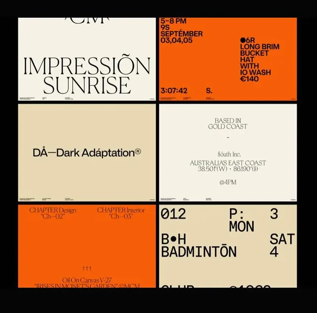
A grid of typographic poster tiles mixing a tall serif headline with bold condensed sans data blocks, on cream and bright-orange grounds with hairline-ruled footers.
Summary
A six-up grid of landscape poster compositions on a black backdrop, alternating cream and bright-orange tiles, each combining one type treatment (an elegant serif headline, a condensed all-caps data list, or a numeric schedule) with tiny ruled spec lines at the bottom.
Visual description
The tiles share a common system: a thin baseline rule across the footer carrying micro caption text, and a deliberate mix of two type voices. One tile sets "IMPRESSION SUNRISE" in a large refined serif with accented diacritics on cream. Its neighbor is bright orange with a tight black condensed-sans block ("LONG BRIM BUCKET HAT WITH 10 WASH") and a running timecode. Lower tiles show centered serif location data ("BASED IN GOLD COAST", coordinates, "@4PM"), an orange chapter-credits card, and a beige schedule grid of big tabular figures ("012 / P:3 / MON / SAT"). Heavy use of bullets, accents, and registered marks gives it a curated, archival feel.
Key takeaway
The two-voice pairing rule applied consistently across a series: a high-contrast serif for the poetic line against a brutally tight condensed sans for the data. Also the hairline footer carrying tiny typographic spec captions, which makes each poster read like a catalogued specimen rather than a one-off.
Reuse notes
A strong reference for a studio portfolio, type foundry showcase, event series, or lookbook that needs many distinct posters to feel like one family. Lock the footer-rule and the serif/condensed pairing as the system, then vary color (cream vs orange) and content per tile. The dense data styling rewards real coordinates, times, and codes, so it can feel hollow with placeholder text.
More like this


Keep what you find
A free account saves references to boards and can send you a weekly email of picks based on what you save.
To see every result, go Pro.