Preview image. Unlock full-res
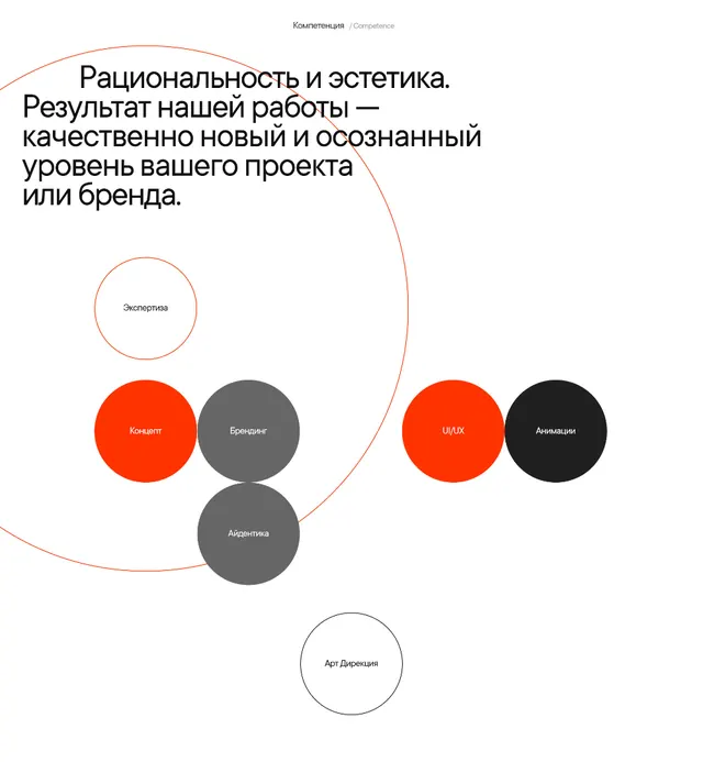
A studio capabilities section that maps creative services onto a cluster of solid orange, grey, and black circles ringed by two thin orbit lines.
Summary
A clean studio capabilities section, in Russian, that lays a creative-services list out as a cluster of solid circles in orange, grey, and black, loosely held together by two faint concentric orbit rings.
Visual description
The top left carries a left-aligned headline in dark sans-serif type, with a small "Competence" label centered above it. Below, six filled circles of roughly equal size group toward the center: two orange, three grey, and one black, each labeled in small white type with a discipline such as concept, branding, art direction, UI/UX, and animation. Two more circles are only outlined, not filled, sitting at the upper and lower edges of the cluster. A thin orange ring and a thin grey ring arc behind the whole group, implying orbit or relation without connecting lines. The palette is restricted to white ground, neutral greys, near-black, and a single hot orange accent, with lots of open white space.
Key takeaway
Communicating a service list as a loose circle cluster instead of a bulleted column: filled solids for active disciplines, hollow outlines for adjacent or optional ones, and one saturated accent color to pull the eye. The two faint orbit rings add structure and motion to the grouping without any literal connector lines.
Reuse notes
A good model for an agency or studio "what we do" section, or a capabilities slide. The filled-vs-outline distinction is a clean way to signal core versus peripheral offerings. Caveat: the unlabeled spatial relationships are decorative, not a real taxonomy, so do not lean on this layout when the relationships between items actually carry meaning.