Preview image. Unlock full-res
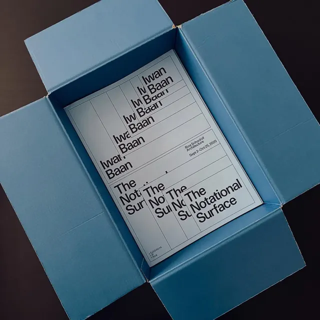
An exhibition poster for a Rice School of Architecture show photographed flat-lay inside an open dusty-blue shipping box, its title set in glitchy overprinted sans-serif.
Summary
A photographed flat-lay of a white architecture-exhibition poster sitting inside a dusty-blue corrugated shipping box, the defining move being the repeated, offset overprinting of the headline that reads as a print-registration glitch.
Visual description
A pale-blue cardboard box with all four flaps splayed open is shot top-down on a dark brown surface, framing a single white A-format poster at its center. The poster carries a faint vertical column grid. Its headline ("Iwan Baan" above, "The Notational Surface" below) is set in a black grotesque sans-serif and printed several times in staggered, slightly rotated overlays so the words smear and double like a misregistered press run. A small right-aligned credit block ("Rice School of Architecture, Sept 3 to Oct 25, 2025") anchors the upper right, and tiny set-sideways type runs down the lower-left margin. The blue box walls take up roughly two-thirds of the frame, leaving the poster as a bright rectangle of negative space.
Key takeaway
The deliberate misregistration: printing the same headline in repeated offset passes turns a legible title into a textural, motion-like mark while staying readable. Also the packaging-as-context shot, presenting the printed piece inside its shipping box rather than on a flat seamless, which sells it as a tangible object.
Reuse notes
Reach for this when launching a print or exhibition identity and you want the announcement image to feel crafted and physical. The overprint headline treatment suits arts, architecture, and culture programs. Caveat: the glitch effect eats legibility fast, so keep the credit and date block clean and unstacked.
More like this






Keep what you find
A free account saves references to boards and can send you a weekly email of picks based on what you save.
To see every result, go Pro.