Preview image. Unlock full-res
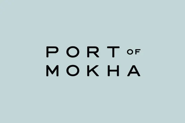
Type specimen showing PORT OF MOKHA in geometric, circular sans-serif on a soft muted blue-green background with uniform stroke weight and spacious letterforms.
Summary
Minimalist type specimen for Port of Mokha featuring all-uppercase sans-serif letterforms with geometric circular bowls on a soft muted blue-green ground, emphasizing refined luxury branding.
Visual description
Centered on a soft muted blue-green background (sage undertone), large black geometric sans-serif capital letters read "PORT OF" across the upper portion, with "MOKHA" on the second line below. The typeface has distinctly circular/geometric letterforms (the O and A especially), uniform stroke weight throughout, and generous spacing between letters. "of" is set noticeably smaller than PORT and MOKHA, creating subtle hierarchy. The composition relies entirely on letterform geometry and negative space, with no decorative elements or color variation.
Key takeaway
The restraint of using a single geometric typeface with color and scale as the only hierarchy tools; circular letterforms and even stroke weight convey both contemporary geometry and timeless elegance simultaneously; the muted cool-toned background allows dark type to sit comfortably without high contrast strain.
Reuse notes
Ideal for luxury goods, hospitality, or refined beverage branding where understated confidence outweighs visual loudness. The geometric precision reads as contemporary without being trendy. Works well in understated campaigns and brand applications where type itself is the hero; not recommended for high-volume body copy.
More like this




Keep what you find
A free account saves references to boards and can send you a weekly email of picks based on what you save.
To see every result, go Pro.