Preview image. Unlock full-res
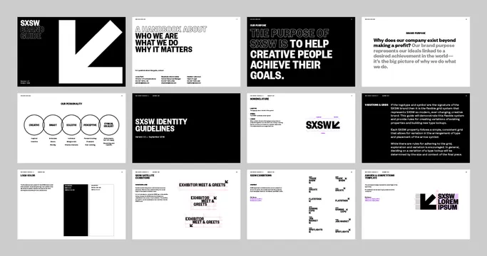
A brand identity system presented across multiple guideline pages with stark black-and-white layouts, bold sans-serif display type, and circular component diagrams.
Summary
A brand identity system presented across multiple guideline pages with stark black-and-white layouts, bold sans-serif display type, and circular component diagrams.
Visual description
A grid of 12 pages from the SXSW brand guidelines, alternating black and white backgrounds. Pages combine bold sans-serif headlines (all-caps, display weight) with diagrams: circular badges showing purpose labels (Inspire, Market, Educate, Promote, Create), stacked blocks showing identity hierarchy, photography sections with dramatic cropping, and text-dense pages with secondary sans-serif body copy. One notable page features a large diagonal white stripe against black; another shows a stark division between a black box and white margins. The geometric language is rigid, structured, and content-focused.
Key takeaway
The circular diagram approach for defining abstract brand values is readable and modular. Using heavy diagonal geometry (the white stripe, black/white splits) creates visual tension without pattern or decoration. The consistent use of space margins and grid guides across pages signals professional authority through restraint and consistency.
Reuse notes
Ideal for event, conference, or organizational identity needing authority and clarity. The stark black-white contrast reads well at small scale and in motion graphics. Best for content-first brands where the system must accommodate varied messaging. The heavy geometric language may feel cold for consumer-facing or lifestyle brands.
More like this








Keep what you find
A free account saves references to boards and can send you a weekly email of picks based on what you save.
To see every result, go Pro.