Preview image. Unlock full-res
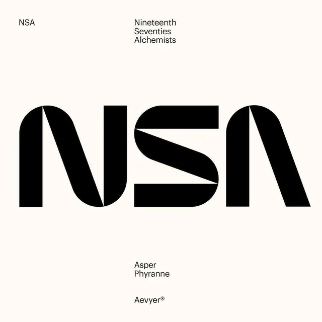
An oversized custom 'NSA' wordmark in solid black, cut by sharp diagonal slices, set on cream with small Helvetica-style labels framing the layout.
Summary
A hugely scaled custom "NSA" wordmark in solid black dominates the center, its letters sliced by sharp diagonals that fuse the three characters into one continuous ribbon. Small sans-serif metadata labels anchor the corners.
Visual description
The square cream canvas is organized like a Swiss specimen sheet. Top left reads "NSA"; top right stacks "Nineteenth / Seventies / Alchemists" in small regular-weight sans-serif. The centerpiece is the wordmark itself: a heavy, condensed display treatment where the N, S and A share angled cuts so the negative gaps form lightning-bolt diagonals running through the type. Each letter is rounded on its outer terminals but knifed by straight slashes internally. Lower-center sits "Asper / Phyranne" and below it "Aevyer" with a registered-trademark mark, both small and quiet, leaving generous empty cream around the giant logotype.
Key takeaway
Cut a custom logotype with a single repeating diagonal angle so the letters share one geometric language and the white gaps become the signature. Frame the hero mark with tiny corner-set metadata labels to give a plain layout an editorial, archival authority.
Reuse notes
Strong template for a fashion, studio or music-label identity that wants type as the entire brand. The diagonal-slice system gives you a matching pattern and secondary marks for free. Needs lots of margin to breathe; crowding the corner labels in would kill the specimen feel.
More like this






Keep what you find
A free account saves references to boards and can send you a weekly email of picks based on what you save.
To see every result, go Pro.