Preview image. Unlock full-res
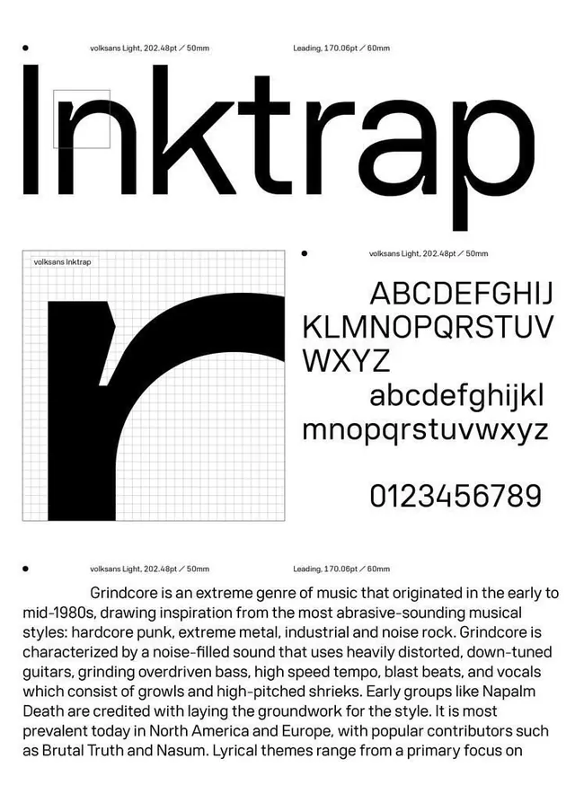
A black-and-white type specimen poster showing the Volksans Inktrap typeface, with a giant 'Inktrap' headline, a gridded letter 'r' detail, full glyph set, and a grindcore body-copy block.
Summary
A type specimen poster for the typeface Volksans Inktrap, built entirely in black on white with engineering-style spec callouts. The defining move is the oversized "Inktrap" headline paired with a single magnified letterform on a measurement grid.
Visual description
The page is organized as a loose modular grid with tiny bullet-dot section markers and gray annotation labels ("volksans Light, 202.48pt / 50mm", "Leading, 170.06pt / 60mm"). A massive lowercase "Inktrap" headline runs across the top, nearly edge to edge. Below left, a single letter "r" is blown up to fill a fine gray measurement grid, exposing the inktrap notch in the joint. Top right stacks the full uppercase set, then lowercase, then numerals 0-9 in a clean grotesque sans. A justified paragraph of body copy about grindcore music anchors the bottom. Pure monochrome throughout, no color, generous white space.
Key takeaway
The spec-callout annotations (point size, leading, millimeter measurements in small gray labels) turn a plain type sample into a technical document, instantly signaling foundry-grade rigor. The single letterform magnified on a visible construction grid is a reusable hero device for any specimen or identity guideline page.
Reuse notes
Reach for this when presenting a custom or licensed typeface, a foundry release, or a brand's type system page. The annotation grammar pairs well with editorial and Swiss-style layouts. Works best in strict monochrome; adding color would dilute the technical-document read.
More like this





Keep what you find
A free account saves references to boards and can send you a weekly email of picks based on what you save.
To see every result, go Pro.