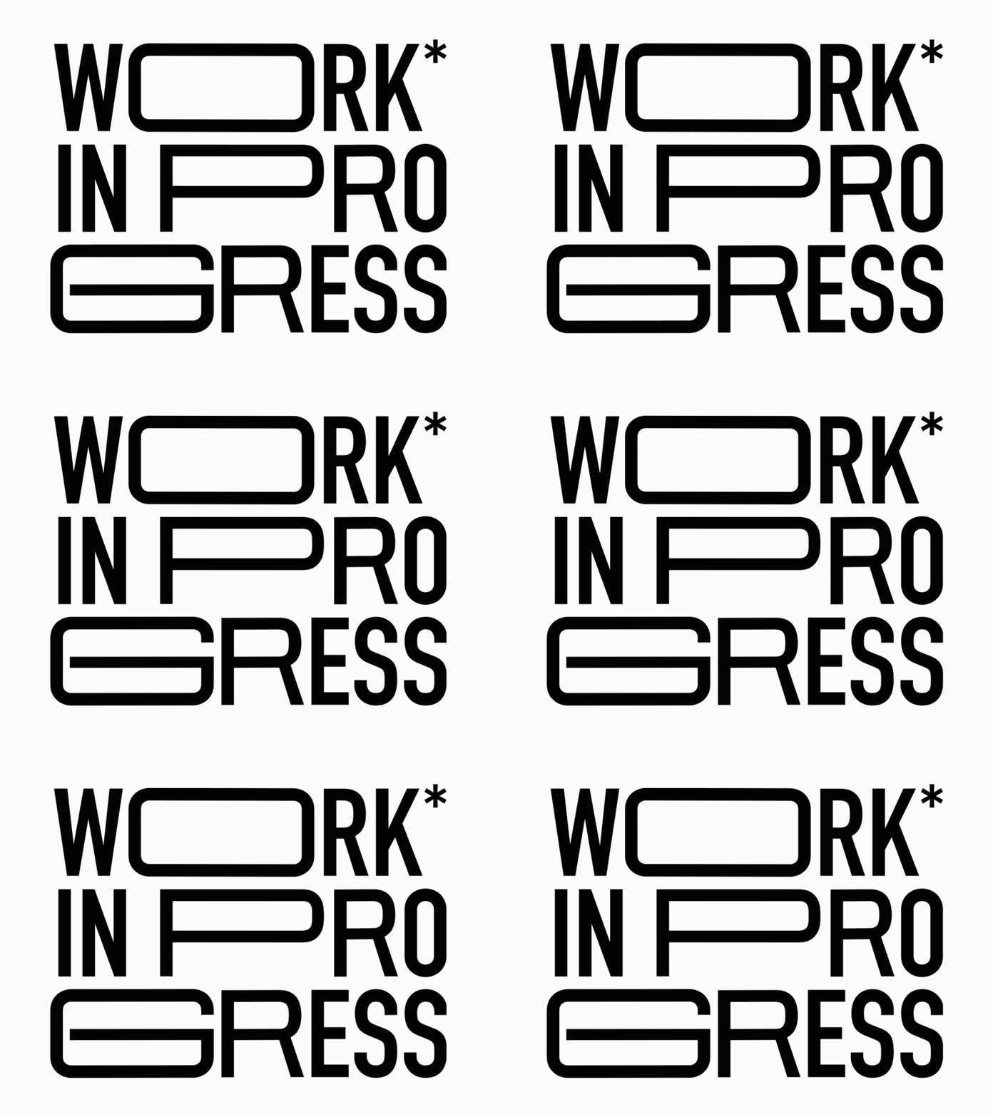
Preview image. Unlock full-res
Animated heavy-black 'WORK IN PROGRESS' lockup on white where letterforms split and shift, an asterisk caps WORK and a solid block stands in for the I.
Summary
An animated typographic mark spelling "WORK IN PROGRESS" in heavy black geometric capitals on white, stacked over three lines, with the letters splitting and re-aligning frame to frame so the lockup itself looks under construction.
Visual description
The frame shown reads WORK / INPRO / GRESS in three tight rows of bold sans capitals, near-black on near-white. The forms are oversized and deliberately broken: several letters are sliced and offset (the R and K shear mid-stroke), a small asterisk sits high after WORK, and the I in IN is replaced by a solid black rectangular block. Across the loop the pieces drift and reset, animating the idea of work in progress. No color, no imagery, pure type as image.
Key takeaway
Substituting a glyph with a plain geometric block (the block-for-I) and sliced, mis-registered letters turns a wordmark into a concept that performs its own meaning. The single asterisk adds a footnote wink at low cost. Three-line all-caps stacking packs a long phrase into a square with maximal weight.
Reuse notes
Ideal for a studio splash, a coming-soon or placeholder screen, a portfolio loader, or a launch teaser where the literal message is "not done yet". Animation reinforces it but the still lockup holds on its own. Caveat: this is a still GIF frame; the deconstruction is intentional, do not mistake the shifted letters for a render error.
More like this



Keep what you find
A free account saves references to boards and can send you a weekly email of picks based on what you save.
To see every result, go Pro.