Preview image. Unlock full-res
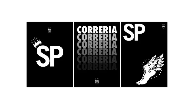
A monochrome brand identity system for Correria SP featuring the initials "SP" with decorative crown and angel wing symbols in bold typography and repeated text.
Summary
A brand identity presentation showing three variations of a monochrome logo system for Correria SP, featuring bold sans-serif letters with decorative crown and wing symbols.
Visual description
Three black-and-white layouts display the brand in different compositions. The left shows a large "SP" initials with a decorative crown symbol above. The center panel repeats "CORRERIA" in descending gray text with varying opacity, suggesting a repetitive or layered branding element. The right panel shows a large "SP" initials with an illustration of a hand with wing-like elements sprouting from it. All layouts use clean black backgrounds and white typography, with small mark details in the corners suggesting additional brand system elements.
Key takeaway
Decorative symbolic elements (crown and wings) add luxury and distinctiveness to a clean geometric letterform. The monochrome palette and bold sans-serif make the brand immediately readable and versatile.
Reuse notes
Excellent for luxury, fashion, or lifestyle brands. The symbolic elements add narrative depth without overcomplication. The black-and-white system is highly versatile for application across media. The geometric letterforms pair well with the decorative flourishes. Works particularly well for heritage or premium positioning.
More like this





Keep what you find
A free account saves references to boards and can send you a weekly email of picks based on what you save.
To see every result, go Pro.