Preview image. Unlock full-res
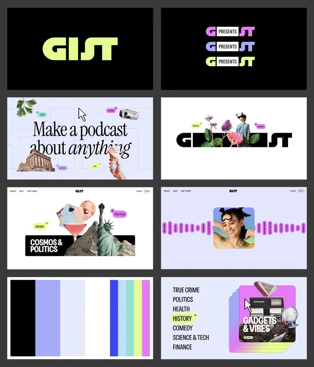
An eight-tile brand board for podcast platform GIST, pairing a lime distorted wordmark with collage-and-pill landing pages across black and lilac panels.
Summary
A four-row, two-column brand-system board for a podcast product called GIST, showing the wordmark, its "G PRESENTS T" lockup variants, web landing screens, a palette strip, and a category menu all in one grid.
Visual description
Eight rectangular tiles laid on a dark mat. Top-left: the lime-green GIST wordmark, a heavy italic-leaning display sans where the letters distort and merge, on black. Top-right: three stacked logo variants splitting the mark into "G [PRESENTS] T" in lilac, blue, and pale tints. The middle tiles are landing-page mockups mixing a serif "Make a podcast about anything" headline with photographic cutouts (a parthenon, ice cream, a VR-headset figure) and bright magenta pill tags labeling categories. Two further tiles show a real site header (PRODUCT, ABOUT, HOW IT WORKS nav) over collage hero art and a horizontal rail of pink category pills. Bottom-left is a vertical color-bar palette (black, periwinkle, lavender, blue, teal, lime, magenta); bottom-right a left-aligned category list (TRUE CRIME, POLITICS, HEALTH, HISTORY...) beside a stacked Polaroid "GADGETS & VIBES" card.
Key takeaway
Using one bright signature color (lime) plus a roster of candy pill-tags to thread a busy collage system together so it stays coherent across very different layouts. Also the smart wordmark play of hiding "PRESENTS" inside the GIST letters to spawn lockup variants without a new logo.
Reuse notes
A strong template for presenting a content or media brand as a single board: mark, lockups, web application, palette, and taxonomy in one view. The collage-plus-pills energy suits youthful media, podcasts, and culture products. Caveat: the maximalist cutout style needs disciplined typography and a fixed palette to avoid tipping into clutter.
More like this





Keep what you find
A free account saves references to boards and can send you a weekly email of picks based on what you save.
To see every result, go Pro.