Preview image. Unlock full-res
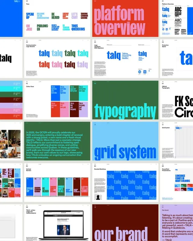
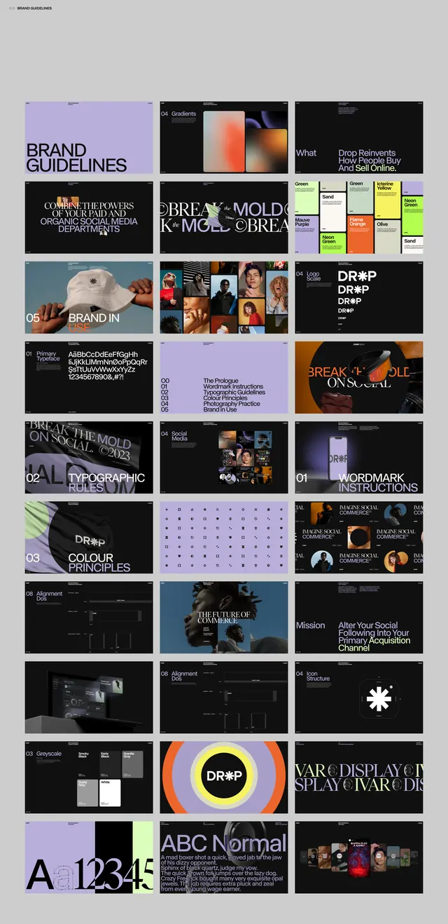
A 24-page brand guideline contact sheet for TALQ built on a bold sans-serif wordmark, multicolor logo variants, and oversized section titles like 'platform overview' and 'grid system'.
Summary
A 24-tile contact sheet of a brand guideline document for "TALQ," a Quebec community brand. Its defining move is the oversized lowercase section titles ("platform overview," "typography," "grid system," "our brand") that fill entire spreads in saturated blue, green, cyan, and dark red.
Visual description
The image is a 4-column grid of guideline pages on a white ground. Recurring elements: the "talq" wordmark set in a heavy geometric sans, repeated in rows of blue, green, cyan, coral, and magenta as logo color variants; full-bleed color spreads carrying the giant section titles; a color-duos page showing paired swatch combinations with labels; a typography page crediting "FK Screamer" and "Circular"; a green spread of running body copy about a 2025 rebrand; vertical color banners spelling words like "SPEAK UP" and "LET'S CHAT"; a tiled blue backdrop of repeated "talq" logos; and a closing "our brand" manifesto page in deep red. A laptop mockup near the bottom shows the brand applied to a news site.
Key takeaway
The color-variant logo grid, one wordmark rendered in the full palette as a system rather than a single locked color. Also the oversized lowercase section dividers that turn navigation labels into the dominant graphic on each spread, giving a guideline document its own visual rhythm.
Reuse notes
A strong reference for assembling a multicolor, type-led brand system, especially community or civic brands that want energy over restraint. The contact-sheet format itself is useful for presenting a full identity at a glance in a deck or case study.
More like this


Keep what you find
A free account saves references to boards and can send you a weekly email of picks based on what you save.
To see every result, go Pro.