Preview image. Unlock full-res
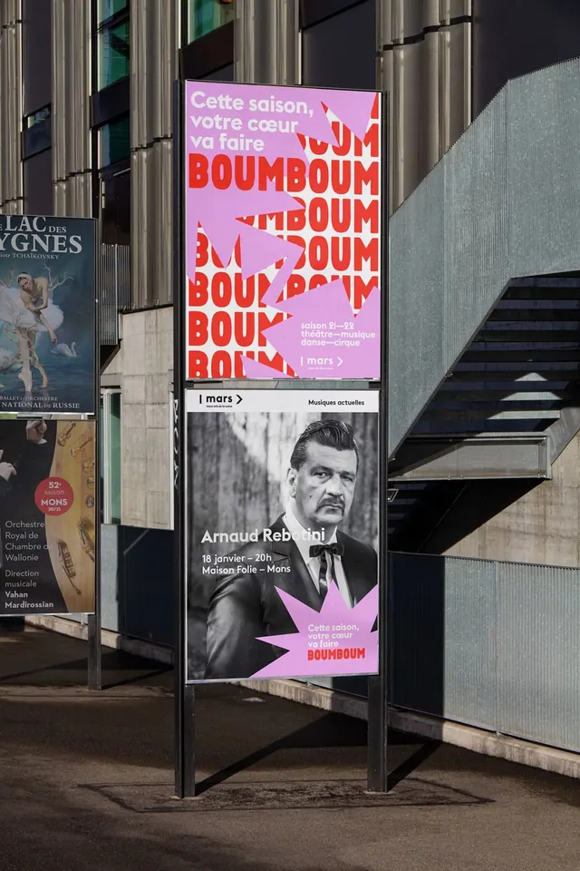
Bold cultural festival poster with oversized red typography repetition on pink background, paired with black-and-white portrait photography of Arnaud Rebotini.
Summary
An outdoor cultural festival poster that combines massive red typography repetition on a soft pink background with a striking black-and-white photographic portrait, mounted on an institutional street-level sign structure.
Visual description
A large rectangular poster mounted on a modern street-level sign frame near a brutalist concrete building with vertical columns. The poster is divided into two sections. The upper half features the word "BOUMBOUM" repeated in large, bold, all-caps red sans-serif letters, fragments and overlapping across a light pink background. The letters are oversized, some bleeding off-canvas, creating a sense of playful, chaotic energy through repetition. The lower half shows a stark black-and-white portrait photograph of a man (identified as Arnaud Rebotini) in profile or three-quarter view, with the BOUMBOUM branding and event details in small white and pink type at the bottom. The color contrast between the hot pink and red of the upper section and the grayscale portrait creates visual separation and hierarchy. The concrete architectural setting (stone facade, steel railings, stairs) provides an austere frame that emphasizes the poster's vibrant color and typographic boldness.
Key takeaway
Oversized repetitive typography as a design move that creates energy through scale and layering rather than variety. The color blocking between hot pink and red creates visual interest while maintaining a constrained palette. The integration of a photographic element with typography-driven design without letting either element dominate. The use of outdoor signage context as part of the design composition.
Reuse notes
A strong reference for cultural institution signage, festival promotion, and event marketing where bold visibility is paramount. The technique of repeated oversized type works particularly well for outdoor and street-level visibility. Best suited for cultural venues, art institutions, and events seeking energetic, contemporary positioning. The stark portrait-photography approach can ground otherwise abstract typographic concepts, making this effective for artist-driven or curator-led initiatives.
More like this
Keep what you find
A free account saves references to boards and can send you a weekly email of picks based on what you save.
To see every result, go Pro.