Preview image. Unlock full-res
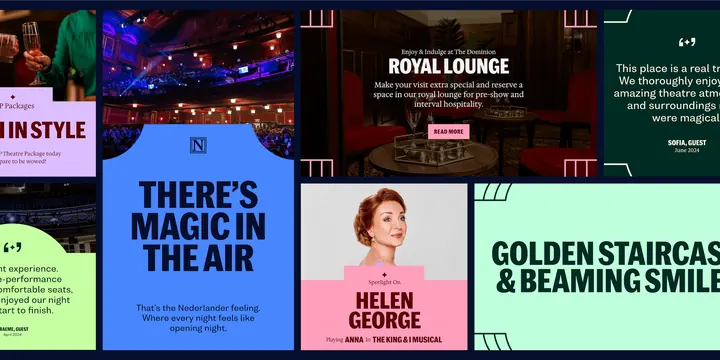
A grid of social and promo tiles for Nederlander Theatres color-blocks bold headlines across royal blue, magenta, mint and black panels, mixing theatre photography with arched cut-outs.
Summary
A composite of promotional tiles for a theatre identity, color-blocked across royal blue, hot pink, mint green and near-black panels, alternating bold sans headlines with arched photo cut-outs and an N monogram.
Visual description
The composite shows roughly eight rectangular tiles arranged on a black ground, each a distinct flat brand color. A royal-blue tile displays a circular N monogram centered above the headline "THERE'S MAGIC IN THE AIR" in heavy navy caps. A photographic tile reads "ROYAL LOUNGE" in white lettering over a dim auditorium interior with a small "READ MORE" button. Mint and lime panels feature testimonial pull-quotes in black. A pink card spotlights a performer named Helen George with an arched photo cutout framing her portrait. A teal panel reads "GOLDEN STAIRCASES & BEAMING SMILE". The recurring visual devices are flat saturated color fields with no gradients, a tall arch-shaped photo mask appearing on select tiles, oversized condensed all-caps headlines, and small utility labels in all-caps, assembled as an interchangeable social and event-promotion toolkit.
Key takeaway
A handful of fixed jewel-tone and acid colors plus one signature arch-shaped photo mask create visual unity across an entire campaign while each tile remains visually distinct. Pairing oversized condensed headline caps with tiny all-caps labels and a single circular monogram scales seamlessly from a testimonial card to a full event announcement. The arch motif echoes a stage proscenium subtly, reinforcing venue context without literal illustration.
Reuse notes
A reference system for any venue, festival, or performing-arts brand needing a flexible social and out-of-home toolkit from a tight color palette and one geometric signature. The arch cut-out and color-block pattern adapt easily to event series, hospitality properties, and nightlife brands. Caveat: the palette is intentionally loud and high-contrast, so the system depends on strict one-color-per-tile discipline to avoid jarring clashes when tiles sit side by side in feeds or installations.
More like this



Keep what you find
A free account saves references to boards and can send you a weekly email of picks based on what you save.
To see every result, go Pro.