Preview image. Unlock full-res
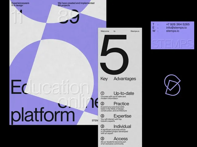
A STEMPS education-brand identity board on black, showing lavender-and-gray Swiss posters, a contact card, and a geometric monogram built from a circle and overlapping diamond.
Summary
A brand-identity presentation for STEMPS, an online education platform, arranging two Swiss-style posters, a lavender business card, and a geometric monogram against a black background.
Visual description
Three artifacts float on solid black. Left, a poster mixing huge ghosted numerals ("11" years, "89" projects) and oversized circles, half lavender and half textured off-white, with "Education online platform" set large across the bottom. Center-right, a tall gray card titled "Welcome to Stemps.io" leads with a giant black "5" over a numbered list of Key Advantages (Up-to-date, Practice, Expertise, Individual, Access) in tight sans-serif. Top-right, a lavender business card carries embossed STEMPS lettering and aligned contact details (phone, email, web). Below it, a thin lavender monogram pairs an open circle with an overlapping diamond. Everything sits on a subtle concrete-paper texture and a precise grid.
Key takeaway
Oversized numerals and circles used as layout structure rather than decoration give a restrained two-color palette real scale and drama. Presenting the system as poster plus card plus mark on a single black field reads instantly as a considered identity, not loose assets.
Reuse notes
A solid template for pitching a small brand identity: one accent color (here lavender), Swiss numeral-driven posters, and a tactile paper texture to warm up the rigidity. Good for education, B2B, or tech brands wanting structure without coldness. The concrete texture is doing a lot of work; on flat backgrounds the layout can feel austere.
More like this







Keep what you find
A free account saves references to boards and can send you a weekly email of picks based on what you save.
To see every result, go Pro.