Preview image. Unlock full-res
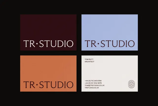
A design studio's cohesive identity system showcasing the TR.STUDIO mark across a curated color palette with application to business collateral.
Summary
A design studio identity system featuring a minimalist serif-dot logo mark applied across four carefully chosen background colors, plus a refined business card template.
Visual description
Four quadrants demonstrate the TR.STUDIO logotype (compact serif letterforms with centered dot separator) on distinct colored grounds: deep maroon, soft periwinkle blue, warm terracotta orange, and cream. The bottom right shows a business card application on cream stock with the logo, designer title, contact info, and a small geometric circular seal. Typography is precise sans-serif in black or dark gray. Layout is grid-based and symmetrical, with generous white space and balanced margins throughout.
Key takeaway
The restraint of a single, adaptable mark. The color palette pairs warm and cool tones without clashing. The business card layout demonstrates how to preserve breathing room while fitting practical information.
Reuse notes
Strong reference for creative service studios, design agencies, and architecture firms. Works for a flexible visual system that scales from letterhead to environmental signage. The color combinations are particularly useful for brands wanting sophisticated but warm positioning.
More like this





Keep what you find
A free account saves references to boards and can send you a weekly email of picks based on what you save.
To see every result, go Pro.