Preview image. Unlock full-res
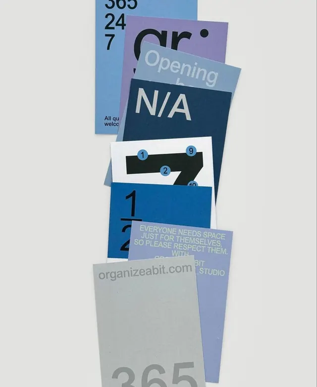
Seven overlapping print collateral cards in a monochromatic blue tonal palette, each displaying cropped oversized sans-serif numerals and type fragments, photographed fanned and stacked.
Summary
Print identity system for organizeabit studio comprising seven flyers arranged in a overlapping fan, each cropping large sans-serif numerals and text fragments against discrete blue and grey tones.
Visual description
Seven cards cascade diagonally down a pale background, each rotated and stacked so only portions are visible. The color range stays strictly cool: multiple shades of blue from sky to deep navy, lavender-grey, and off-white. Each card crops a different content layer of the identity: "365 / 24 / 7" on one edge in dark sans, a partial arched wordmark "organizeabit", the word "Opening" reversed in light type on periwinkle, "N/A" in large white on navy (implying "Coming Soon"), a black oversized "7" on white with blue-circled index numbers (1, 2, 9, 10) placed as annotations atop it, a fraction "1/2" in black, a paragraph of small text in tone-on-tone grey reading "EVERYONE NEEDS SPACE JUST FOR THEMSELVES... WITH RESPECT...", the URL "organizeabit.com" on lavender, and a ghosted "365" bleeding off a grey card at bottom. Type throughout is a single condensed grotesque sans-serif; no color distinction, only scale and tonal value shift the hierarchy.
Key takeaway
An entire collateral kit developed from one tight condensed grotesque, oversized numerals, and a blue-family tonal palette alone, with no secondary hues or illustration. Cropping type aggressively across overlapping cards creates visual drama and depth. Small blue-circled numbers over a giant figure add a diagram or annotation layer, suggesting system and logic. Photographing cards fanned rather than flat demonstrates the system as a tactile family in a single image.
Reuse notes
A model for studio, agency, or service identities needing systematic restraint over decoration. Useful when you have many small pieces of information (hours, fractions, statements, contact) that must feel unified. Requires each card to work both cropped (in the fan) and whole (standalone)—design defensively for both layouts. The monochromatic tonal approach reads more "organized" and "serious" than multi-color, making it ideal for studio or administrative contexts.
More like this






Keep what you find
A free account saves references to boards and can send you a weekly email of picks based on what you save.
To see every result, go Pro.