Preview image. Unlock full-res
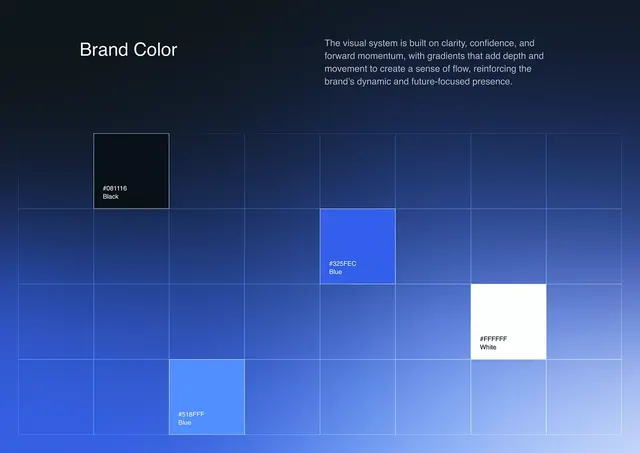
A brand-guideline color page placing a few labeled blue, black, and white swatches across a faint grid over a deep navy-to-blue gradient background.
Summary
A brand-guideline color page that scatters a handful of labeled swatches, black, royal blue, and white, across a faint open grid laid over a deep diagonal navy-to-blue gradient. The full-bleed gradient itself, not the swatches, sets the brand tone.
Visual description
The page is built on a smooth diagonal gradient running from near-black navy in the top-left to a lighter royal and powder blue toward the bottom-right. A thin white line grid of equal squares overlays the lower two-thirds, mostly empty. Three filled swatches sit in separate cells at staggered positions: a near-black tile labeled "#081116 Black" upper-left, a saturated "#325FEC Blue" mid-frame, a pure "#FFFFFF White" lower-right, plus a lighter "#518FFF Blue" near the bottom, each carrying its hex code and a one-word name in small sans-serif. The header reads "Brand Color" at left with a short justified support paragraph at right describing clarity, confidence, and forward momentum. Everything is left-to-right calm, high-contrast type on a low-contrast field.
Key takeaway
Presenting brand colors not as a tidy adjacent swatch strip but as individual chips dropped into an airy grid floating over a live gradient, so the page demonstrates the gradient in use while it documents the discrete values. Labeling each chip inline with both hex and plain name keeps it spec-accurate and human at once.
Reuse notes
A clean template for the color page of a tech, fintech, or security brand guide, especially one whose identity leans on a gradient rather than flat colors. The scattered-grid layout reads as premium and intentional but needs disciplined spacing; keep most cells empty and let the gradient breathe. Works only on dark; the white-on-navy labels depend on it.
More like this








Keep what you find
A free account saves references to boards and can send you a weekly email of picks based on what you save.
To see every result, go Pro.