Preview image. Unlock full-res
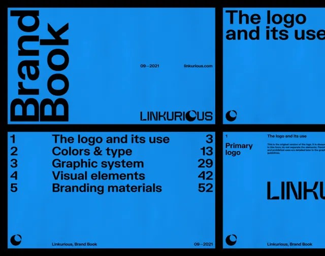
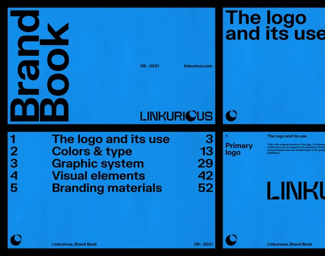
High-contrast identity guideline page with bold electric blue field, black typography, and grid-organized sections documenting logo usage, color system, and graphic devices.
Summary
A brand identity guideline page using an electric blue field with black type and grid-organized sections to document logo, color palette, graphic devices, and system components.
Visual description
A bright, saturated electric blue background dominates the frame. Black sans-serif headings and body text are organized into discrete gridded sections, each labeled and separated by clear white dividers. Visible sections include "The logo", "The logo and its use", "Colors & type", "Graphic devices", and "Branding materials", each showing imagery or specifications. The typography is bold and confident at headline scale, more modest in supporting copy. The rigid grid and stark two-color palette (blue, black, white, and image areas) create maximum clarity and organizational precision. No gray tones or soft transitions; every element is decisive.
Key takeaway
The authority of a near-monochromatic color system paired with aggressive typography. The grid as a literal design tool, not just layout: divisions are visually meaningful and guide the eye through complex information. Confident use of a single vibrant hue (electric blue) as the dominant brand statement.
Reuse notes
Ideal for media, publishing, and corporate identity systems seeking to project clarity and modernity. The high-contrast palette ensures photocopiability and digital legibility. Works well for guidelines that must be quickly scannable and authority-forward. The blue-heavy palette leans tech/professional; consider alternatives (red, green, black) for other industries.
More like this



Keep what you find
A free account saves references to boards and can send you a weekly email of picks based on what you save.
To see every result, go Pro.