Preview image. Unlock full-res
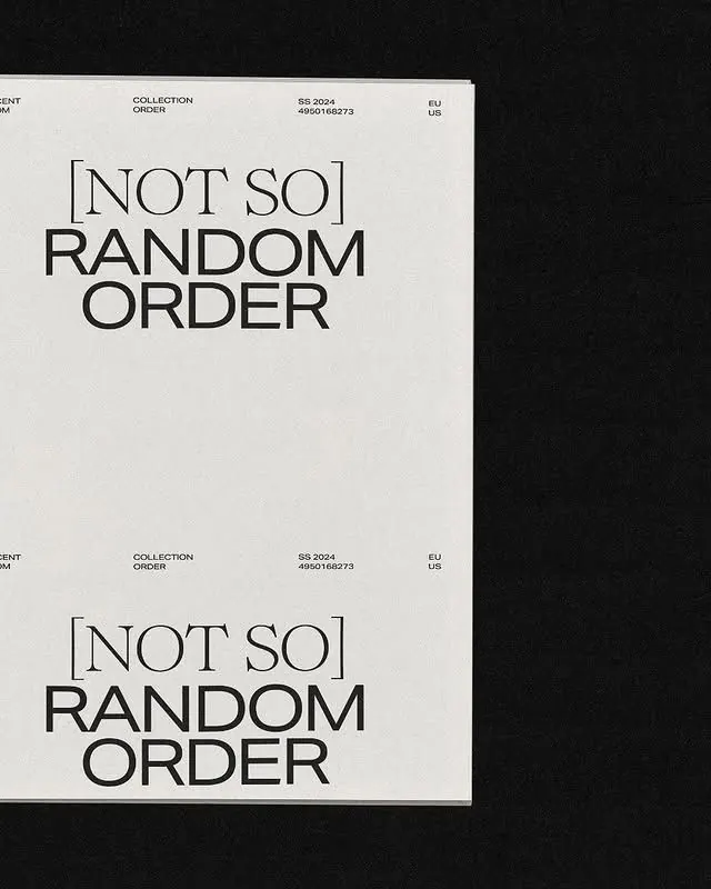
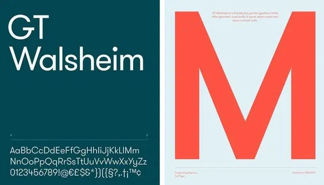
A starkly minimal type specimen showing NOT SO RANDOM ORDER repeated twice in bold sans-serif on off-white stock with collection metadata marginal notes.
Summary
A catalog cover or type specimen spread showing NOT SO RANDOM ORDER in bold display sans-serif, repeated twice on an off-white field with minimal marginal metadata.
Visual description
The page is a clean two-up spread on an off-white background. At the top-left corner, small sans-serif labels in dark grey read COLLECTION / ORDER and BR 2024 / EU US. Centered in the upper half is the phrase NOT SO RANDOM ORDER set in large, bold, all-caps display sans-serif (likely a heavier weight typeface, possibly serif or geometric). The composition repeats identically below with the same marginal text repositioned. Ample white space surrounds the text, emphasizing the geometric severity of the layout. No imagery, color, or ornament.
Key takeaway
The grid discipline of a two-up symmetrical catalog spread. The oversized, heavily weighted sans-serif headline isolated in white space creates tension through restraint. Using metadata (collection code, date, region) as navigational texture in the margins without cluttering the focal typographic area.
Reuse notes
Strong model for minimalist type catalogs, collection lookbooks, or fashion/design brand systems that need typographic authority without decoration. The symmetry reads as institutional, archive-like. Works when the typeface itself is the subject. Needs confident typography and confident negative space to avoid feeling undershouted or empty.
More like this





Keep what you find
A free account saves references to boards and can send you a weekly email of picks based on what you save.
To see every result, go Pro.