Preview image. Unlock full-res
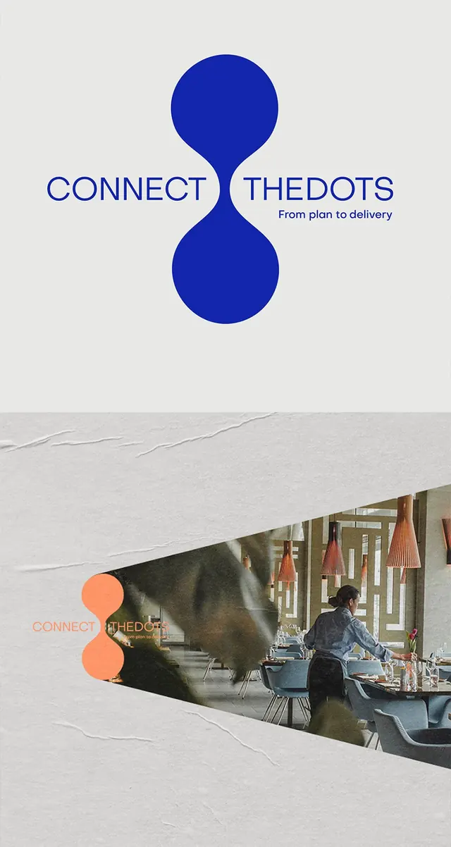
Consulting logo built from a vertical figure-eight of two stacked dots in cobalt blue, splitting the wordmark CONNECT and THEDOTS, shown on grey board and over a restaurant photo.
Summary
A consulting identity whose mark is a vertical figure-eight of two stacked circles in cobalt blue, set between the two halves of the wordmark so the dots literally connect CONNECT to THEDOTS.
Visual description
Top panel: on a warm grey board the blue figure-eight sits center, its waist aligned to a single baseline of all-caps medium-weight sans-serif reading CONNECT on the left and THEDOTS on the right. A small italic-lean tagline, From plan to delivery, tucks under the right word. Lower panel shows the same lockup recolored orange and laid over a triangular cut-out reveal of a styled restaurant interior, copper pendant lamps and a server setting tables, the whole thing framed by torn and creased paper texture as a stationery mockup.
Key takeaway
Using a repeated geometric glyph as both logo and word-separator, so the mark earns its place in the lockup instead of floating beside it. The torn-paper reveal that crops a lifestyle photo into a diagonal sliver is a cheap way to make a flat logo feel art-directed.
Reuse notes
Good reference for a service or consulting brand that needs one memorable geometric mark plus a flexible single-color recolor. The figure-eight reads as infinity and connection; pair it with a restrained all-caps grotesk. Watch the tagline legibility when the lockup is dropped onto busy photography.
More like this







Keep what you find
A free account saves references to boards and can send you a weekly email of picks based on what you save.
To see every result, go Pro.