Preview image. Unlock full-res
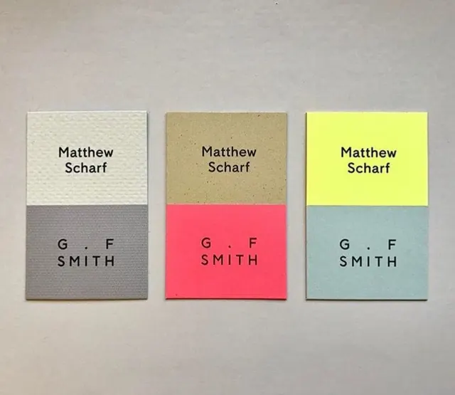
Three business cards for Matthew Scharf x G.F Smith, each split into a two-tone color block with name above and G.F SMITH letterspaced below on textured stock.
Summary
Three portrait business cards laid out in a row, each divided into a top and bottom color block, with Matthew Scharf set above and a widely letterspaced G.F SMITH below.
Visual description
Three vertical cards photographed flat on a warm grey paper backdrop. Each shares the same layout, a horizontal split roughly at the midpoint, but uses a different two-tone color pairing: textured off-white over grey, kraft-tan over coral pink, and acid yellow over pale sage. Matthew Scharf sits in small black sans-serif near the top of every card; G.F SMITH runs across the lower block in the same face but generously letterspaced, with a centered dot between the initials. The stocks are visibly different, one embossed with a fine dot texture, the others smooth, so the set doubles as a paper sample. Soft top lighting casts faint shadows that lift the cards off the surface.
Key takeaway
Holding one rigid layout constant and varying only the color pairing turns a single card into a system and a paper showcase at once. The wide letterspacing on G.F SMITH against the tight upper name creates hierarchy with type treatment alone, no size jump needed. The split block lets one card carry two materials or finishes.
Reuse notes
A clean reference for any identity that ships as a variation family, business cards, swatch sets, or a paper-merchant sampler. Pairs naturally with uncoated or specialty stocks where texture is the selling point. Caveat: the system depends on disciplined, restrained color pairs; pushing every card to high saturation would break the calm.
More like this


Keep what you find
A free account saves references to boards and can send you a weekly email of picks based on what you save.
To see every result, go Pro.