Preview image. Unlock full-res
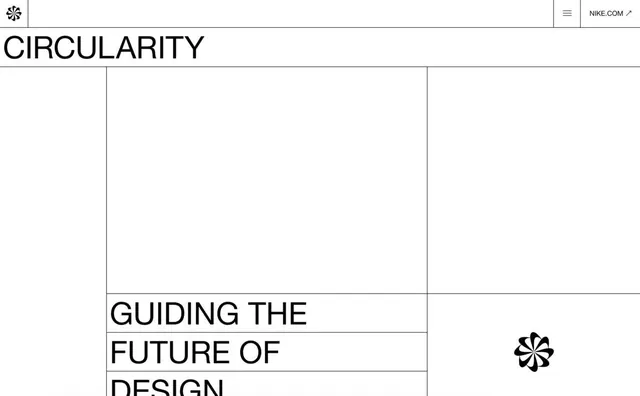
Nike's 'Circularity' page header with structured grid layout, architectural lines dividing headline into progressive rows.
Summary
Nike's 'Circularity' page header with structured grid layout, horizontal rules dividing the headline across progressive rows.
Visual description
Nike's circular four-leaf logo sits in the top-left corner above the main heading. The word 'CIRCULARITY' appears in large black sans-serif caps, followed by horizontal black lines that segment the remaining headline 'Guiding the Future of Design' into three stacked rows, each rule-bounded. The Nike logo reappears bottom-right as a visual anchor. White background dominates, with the grid of black lines and type creating a formal, architectural feel. The layout reads as highly structured and methodical, suggesting order and sustainable design principles.
Key takeaway
The rigid horizontal-line grid as a visual metaphor for systematic thinking and structured sustainability narrative; the dual logo placement (top-left icon, bottom-right mark) bookending the content creates compositional balance and reinforces brand presence without clutter.
Reuse notes
Effective for corporate or sustainability-focused communications where systematic methodology and precision matter. The grid structure suggests research, rigor, and planned processes, making it suitable for B2B and environmental initiatives. Works best with generous white space and sans-serif type for maximum clarity.
More like this




Keep what you find
A free account saves references to boards and can send you a weekly email of picks based on what you save.
To see every result, go Pro.