Preview image. Unlock full-res
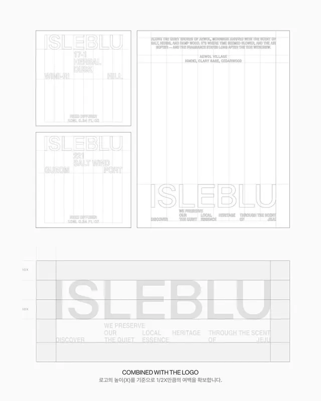
ISLEBLU fragrance identity built on an exposed grid structure, using stencil-like typography and descriptive place-names arranged across label mockups and a grid specification sheet.
Summary
ISLEBLU is a fragrance brand identity using a strict proportional grid where all typography is set as stencil-letters in outline form, with location names (Hinoki, Clary Sage, Cedarwood, etc.) positioned across square labels and a grid construction diagram.
Visual description
Three sections visible: two square label mockups on top (each 1.0L bottle format), a large square label specification on the bottom-right, and a grid diagram (labeled "1/2x" and "1/2x") on the bottom-left showing the proportional construction. All backgrounds are white or light grey with black stencil-style letters (letters are outlines, not filled). The label mockups show "ISLEBLU" in large stencil caps, followed by scent ingredient names in smaller caps (e.g., "HINOKI, CLARY SAGE, CEDARWOOD"). A descriptive subtitle appears below in light grey. The specification sheet is dominated by the large "ISLEBLU" wordmark at bottom-right in the same stencil style. The grid diagram shows precise vertical and horizontal divisions with cross-hair markers and "1/2 x" labels, communicating exact proportions and alignment rules. Every element aligns to the underlying grid; there is no free placement.
Key takeaway
The stencil-letter treatment which combines minimalism with a craft/industrial feel suitable for luxury goods. The grid specification diagram included alongside the label mockups, making the system immediately understandable and reproducible. Using light grey descriptive text below the mark to add hierarchy and scent-note information without competing with the wordmark.
Reuse notes
Strong template for fragrance, cosmetics, or specialty food packaging where grid-based precision conveys quality and consistency. The monochrome + grid approach works best for luxury positioning; would benefit from being paired with a secondary color or material texture if the brand is more playful. The stencil style is particularly effective at small scale and reads well on physical bottles or boxes.
More like this



Keep what you find
A free account saves references to boards and can send you a weekly email of picks based on what you save.
To see every result, go Pro.