Preview image. Unlock full-res
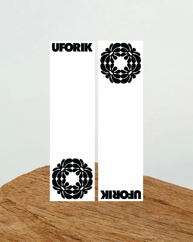
A black wordmark and floral emblem are arranged on two tall white bookmark-like cards in a photographed mockup scene.

Summary
A black wordmark and floral emblem are arranged on two tall white bookmark-like cards in a photographed mockup scene.
Visual description
Two tall white rectangular cards stand side by side on a warm wooden surface against a pale textured background. The left card has a bold black all-caps wordmark near the top and a matching floral circular emblem near the bottom, while the right card has the emblem near the top and the wordmark rotated upside down at the bottom.
Key takeaway
Use a simple two-piece layout to present alternate logo placements or lockups in a clean, memorable way. The heavy black mark against lots of white space makes the identity feel graphic and immediate.
Reuse notes
Reach for this when showing a wordmark plus symbol pair, especially for fashion or lifestyle branding. It works best when the goal is to emphasize form, contrast, and symmetry rather than detailed messaging.
More like this




Keep what you find
A free account saves references to boards and can send you a weekly email of picks based on what you save.
To see every result, go Pro.