Preview image. Unlock full-res
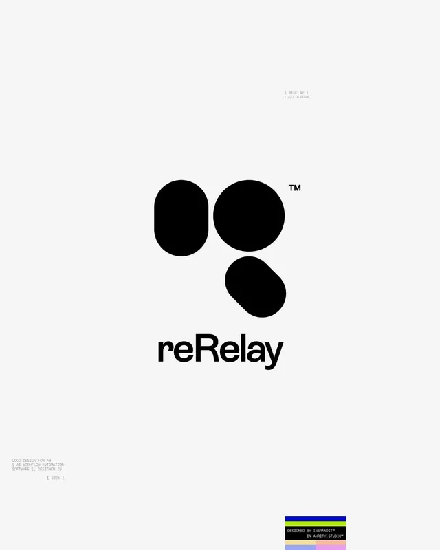
Logo presentation for reRelay, an AI workflow automation tool, building a lowercase 'g' mark from three black organic blobs above a clean sans-serif wordmark.
Summary
A logo presentation board for "reRelay" that constructs a lowercase letter "g" from three separate solid-black organic blobs, set on an off-white field with a small superscript TM.
Visual description
The mark sits centered in the upper-middle of a near-white canvas. It reads as a lowercase "g" assembled from three distinct rounded forms: a tall pill on the left, a larger circle top-right, and a kidney-shaped blob below that closes the descender, each form separated by tight negative-space gaps. A small black "TM" floats at the upper right of the mark. Below, the wordmark "reRelay" is set in a medium-weight black sans-serif with a tight, even color. Thin gray monospaced annotations frame the layout like a case-study sheet: a "[ RERELAY ] LOGO DESIGN" caption top-right, a credit block lower-left noting it as a logo for an AI workflow automation software dated "[ 2026 ]", and a small four-color (blue, lime, pastel) studio swatch badge bottom-right.
Key takeaway
Building a single letterform out of disconnected solid blobs, so the eye completes the shape across the gaps, gives a friendly, modern mark without any outlines or gradients. Pairing it with thin monospaced corner annotations turns a plain logo lockup into a presentation artifact that signals craft.
Reuse notes
Strong reference for an AI, SaaS, or developer-tool identity that wants approachable geometry rather than hard tech edges. The blob-letter trick works best for letters with a clear silhouette (g, a, e). Reuse the monospace-caption framing whenever you need to present a single logo in portfolio or pitch context.
More like this

Keep what you find
A free account saves references to boards and can send you a weekly email of picks based on what you save.
To see every result, go Pro.