Preview image. Unlock full-res
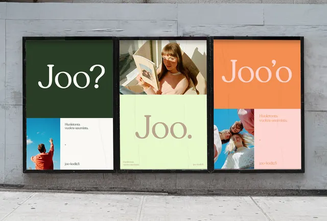
Three framed Joo posters mounted on a concrete wall, each combining a large serif headline with lifestyle photography over olive, mint, and orange color blocks.
Summary
A poster campaign shown in situ as three black-framed billboards on a grey concrete wall, unified by the same oversized serif Joo headline rendered in shifting color schemes across the panels.
Visual description
Three vertical posters hang side by side in thin black frames. The left poster is deep olive green with a white serif Joo? above a small white caption card and a photo of a person against blue sky. The center poster pairs a top photo of a woman reading with a mint-green lower block carrying Joo. in olive serif. The right poster runs warm: a terracotta-orange top band with a pale serif Joo'o, a soft-pink caption block, and a blue-toned lifestyle photo below. Each panel splits into stacked rectangles of solid color and cropped photography, with small Finnish body copy and a wordmark anchored bottom-left. The display serif is high-contrast with elegant ball terminals.
Key takeaway
One headline word recolored per panel to build a campaign that reads as a set while each piece stays distinct. The consistent grid (large color block plus cropped photo plus a small caption card) lets the photography and palette change without the system feeling loose.
Reuse notes
A clean reference for an out-of-home or print campaign in fashion, lifestyle, or editorial. The muted olive-mint-terracotta palette with a high-contrast serif reads premium and calm. Use the in-context wall mockup itself when presenting poster concepts to a client. Hold the grid steady so the recolored panels stay recognizable as one family.
More like this

Keep what you find
A free account saves references to boards and can send you a weekly email of picks based on what you save.
To see every result, go Pro.