Preview image. Unlock full-res
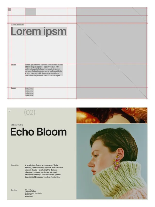
Editorial identity system showcasing soft-contrast palette and organic photography paired with structured grid layout and bold display type.
Summary
Editorial identity guide showing "Echo Bloom" - a soft, warm visual system juxtaposing structured type layouts with luminous portrait photography and delicate texture details.
Visual description
The image shows two distinct presentations of the Echo Bloom identity. The upper section uses a strict baseline grid with fine pink-line structure, organizing body copy, a prominent sans-serif headline, and a large gray photographic area with a diagonal plane. The lower section introduces the full brand context: a pale beige background, bold sans-serif headline, descriptive copy about "softness and contrast," and a portrait of a woman in profile wearing a hand-knit cream sweater, with warm-toned textured accessories. A separate color-blocked section displays Neue Haas Grotesk in multiple weights and cases, along with numeric and special-character sets in two languages. Bottom-third images show the identity applied to outdoor signage, printed materials, and merchandise.
Key takeaway
The soft warmth created by near-neutral palette (cream, sage, warm gray, gold accents) paired with high-contrast black type. The use of a strict grid as a calming organizational device. How the single portrait photograph dominates the second half, proving that one strong image can carry a brand identity guide. The discipline of using a single geometric sans-serif across every application.
Reuse notes
Excellent model for fashion, beauty, and editorial brands. The pale beige background and sage tones work well for contemplative, handcrafted, or wellness-focused companies. Not suited for tech or fast-moving sectors. Grid approach is useful when clarity and documentation precision matter (brand guidelines, type specs, campaign decks).
More like this



Keep what you find
A free account saves references to boards and can send you a weekly email of picks based on what you save.
To see every result, go Pro.