Preview image. Unlock full-res
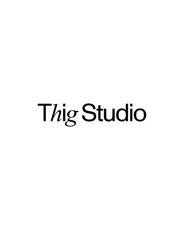
A centered serif wordmark centered in vast negative space, balancing typographic elegance with graphic simplicity.
Summary
A centered serif wordmark centered in vast negative space, balancing typographic elegance with graphic simplicity.
Visual description
A single serif wordmark, "Thig Studio," rendered in black on a light neutral background. The letterforms show a classical serif typeface with moderate contrast between strokes and consistent proportions. The word sits centered horizontally and slightly below center vertically, with approximately 80 percent of the composition left as white space. The lack of additional graphic elements, color variation, or decorative marks emphasizes the form and readability of the type itself. The composition conveys restraint and sophistication through whitespace alone.
Key takeaway
The confidence to let typography carry the full weight of the branding story. The generous whitespace becomes a design element itself, creating breathing room that signals quality and intentionality. This approach works because the letterforms are distinctive and well-spaced enough to be the sole focal point.
Reuse notes
Effective for design studios, creative agencies, and luxury brands where restraint and typographic mastery convey expertise. Works best when the wordmark has elegant proportions and legible serifs at the intended display size. Pair with editorial or fine art contexts where quietness and clarity communicate premium positioning. Avoid cluttered or detailed secondary graphics that would compete with the type.
More like this






Keep what you find
A free account saves references to boards and can send you a weekly email of picks based on what you save.
To see every result, go Pro.