Preview image. Unlock full-res
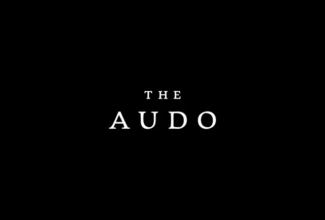
A centered wordmark in refined serif capitals with expansive letter-spacing, anchored by a lighter overline label.
Summary
A centered wordmark in refined serif capitals with expansive letter-spacing, anchored by a lighter overline label.
Visual description
The main wordmark sits centered on a pure black background, rendered in a high-contrast serif font with generous spacing between each capital letter. Above the primary text, a smaller uppercase label "THE" introduces the mark. The contrast between pure white letterforms and the black void creates an austere, elegant aesthetic. All typography is rendered in a classical serif face with uniform stroke weight, emphasizing clarity and restraint.
Key takeaway
The extreme letter-spacing (nearly twice the normal tracking) conveys luxury and exclusivity. The minimal two-tier hierarchy (overline label plus main mark) is editorial-clean. The black-and-white palette with zero ornamentation works for premium brands in music, creative services, and luxury goods.
Reuse notes
Excellent foundation for music labels, audio equipment brands, or creative agencies. The serif choice feels distinctly upmarket, fitting for heritage or premium positioning. Requires a strong primary wordmark to sustain the minimalism; weak type ruins the effect. Scale generously for impact.
More like this





Keep what you find
A free account saves references to boards and can send you a weekly email of picks based on what you save.
To see every result, go Pro.