Preview image. Unlock full-res
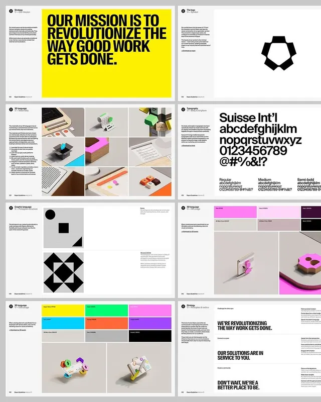
An eight-page brand guidelines deck shown as a grid, pairing a yellow all-caps mission spread and a hexagonal flower logo with isometric 3D objects and a Suisse Int'l type page.
Summary
A contact-sheet view of eight pages from one brand guidelines document, arranged in a 2-column, 4-row grid. It spans mission statement, logo, 3D language, typography, pictogram system, and color usage, held together by a strict white grid and a single hot-yellow accent.
Visual description
Top-left: a full-bleed yellow page with a heavy black all-caps headline, "OUR MISSION IS TO REVOLUTIONIZE THE WAY GOOD WORK GETS DONE". Top-right: a white logo page presenting a black hexagonal flower/cog symbol. Second row pairs a grid of colorful isometric 3D objects (calculators, devices, blocks in cyan, magenta, lime, yellow) labeled "3D language" against a large "Suisse Int'l" type specimen showing the alphabet, numerals and three weights. Third row shows a pictogram-construction page (circle, square, triangle building blocks plus an X-mark logo) beside color-usage swatch tables and a magenta 3D phone render. Bottom row repeats a vibrant swatch grid and more isometric renders, then closes on a tactics spread with mixed-size black headlines. Tiny running heads ("Dayos Guidelines") and folios sit at page edges. Palette is mostly black-on-white with yellow as the loud anchor and saturated cyan/magenta/lime/orange confined to the 3D and swatch pages.
Key takeaway
The discipline of one screaming accent (yellow) reserved for the mission page while every system page stays black-and-white, so color reads as a deliberate signal, not decoration. The isometric 3D object library gives an otherwise Swiss/grid identity a playful, ownable texture without breaking the typographic rigor.
Reuse notes
A strong reference when pitching or building a full brand-guidelines deck for an agency, consultancy, or B2B product. Reach for it when you want Swiss type rigor but need warmth and energy, supplied here by the 3D renders and the yellow. Caveat: the saturated 3D palette only works because the rest of the system is monochrome; loosen that and it tips into noise.
More like this


Keep what you find
A free account saves references to boards and can send you a weekly email of picks based on what you save.
To see every result, go Pro.