Preview image. Unlock full-res
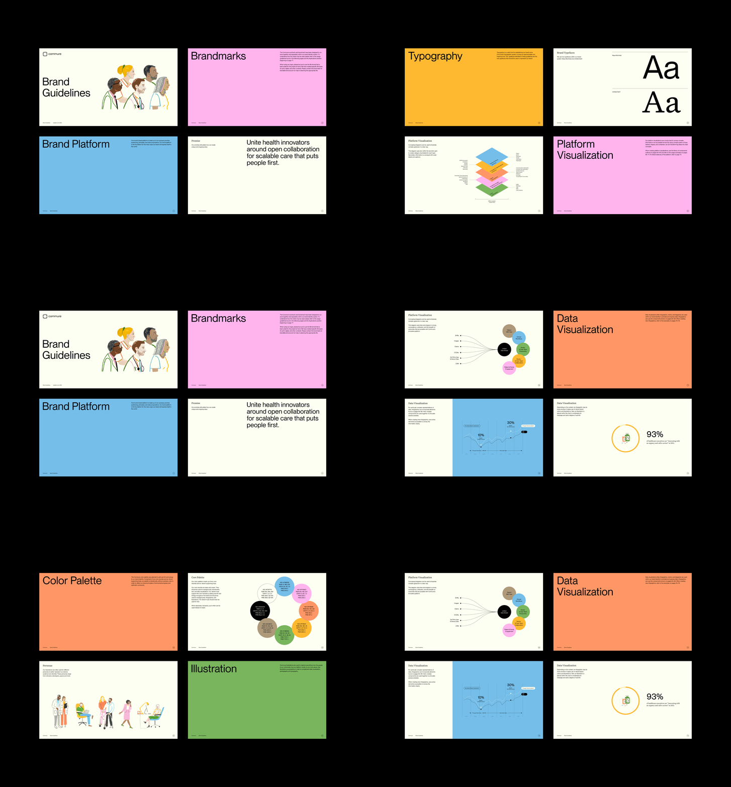
Four color-blocked brand-guideline pages covering typography and an isometric platform-visualization diagram, in yellow, cream, magenta and white.
Summary
A 2x2 grid of landscape brand-guideline pages on a black backdrop, each a different solid color, walking through the brand's typography rules and an isometric diagram standard for visualizing a healthcare platform.
Visual description
Four pages, all sharing the same footer line and a small circular page number in the bottom-right corner. Top-left is a saturated marigold-yellow page titled "Typography" in large black sans-serif with a short right-aligned intro paragraph. Top-right, on cream, is "Brand Typefaces" showing two huge specimen "Aa" glyphs labeled Neue Montreal (sans) and Untitled Serif, separated by hairline rules. Bottom-left, on near-white, is "Platform Visualization": a centered isometric stack of colored parallelogram planes (blue, yellow, orange, pink, green) with tiny annotation labels fanning out to either side and a bracketed caption below. Bottom-right repeats "Platform Visualization" as oversized black type on a hot-magenta field with explanatory body copy. The system runs on bold color-blocking, a consistent header-and-footer grid, and a sans-plus-serif type pairing.
Key takeaway
Giving every guideline page its own full-bleed brand color so a contents-spread reads as a swatch system at a glance, while a fixed footer and corner page-number keep it unified. Also the isometric layered-plane diagram as a reusable device for explaining a complex platform's stack to non-technical readers.
Reuse notes
A solid model for a B2B or healthcare-tech brand book that needs to feel energetic rather than sterile. The marigold-cream-magenta-on-black sequence is the memorable move. Pairs well with a clean Neue-Montreal-style sans and a contrast serif. Caveat: full-saturation backgrounds demand careful body-copy contrast, especially the magenta page.
More like this




Keep what you find
A free account saves references to boards and can send you a weekly email of picks based on what you save.
To see every result, go Pro.